The right combination of colors in the interior of the kitchen: secrets designer
In the modern home kitchen - not only cooking zone. Usually it combines still and dining functions, and in some cases, and living rooms. Therefore, special attention requires the combination color in the interior food.
How to choose the color
Choosing color combinations, should be taken in the calculation of the size of the room. Optical illusion of space changes, inherent in different colors, capable of visually constrict or expand room. for example, dark colors will reduce the already small-sized "Khrushchev" kitchen, and bright, if you do not observe moderation, cause irritation and lead to eye strain. In this situation, appropriate light and pastel shades, as they move apart visually room boundaries. The opposite situation from owners of large kitchens, - should be used with caution in cold colors, as they will make the room look like a production hall. Cosiness give warm colors, and dark colors in the interior of kitchen look elegant and refined.
Tools of color
Kitchen interiors differ markedly wider color range, and choose the color combination in the interior without a hint of a professional rather difficult. To the aid of special tools.
Color wheel - combined on a three-axis drive, which caused the basic colors of the color spectrum, the maximum possible number of shades, contrast mesh. According to the laws of color of color, their shades, slots arranged so, it was convenient to pick up a balanced mix of colors to each other.
Dvenadtsatichastny circle color combinations made up of the colors of the 1st, 2-the second and third orders:
- yellow, blue, red.
- green, Orange, Violet.
- yellow orange, red-orange, red-purple, indigo blue, blue-green, yellowish green.
The colors of the 2nd order produces pairwise mixing the colors of the first order.
The colors of the third order - mixing COLOR 1st and 2nd order on the principle of "everyone with everyone".
In fact - it is a tool to display all the major schemes of color, a kind of color palette. The combination of colors in the interior can also choose from special tables. Find these tables in the Internet will not be working, but there is a caveat - on the screen and in real life can be different shades.
Location on the disk and the combination of colors:
- complementary: It is located on the circle opposite the diameter. mix well.
- analog: stand next to, also combine well, but contrasting. One selected as the primary, arc complements it.
- triad: three shades make an equilateral triangle, if you build it on the disk. Embodiment of variations using process colors by causing difficulty, but offset by a balanced and original result.
- neutral: white, Gray, the black. Due to the good compatibility actively used for home decoration.
![analog combination]()
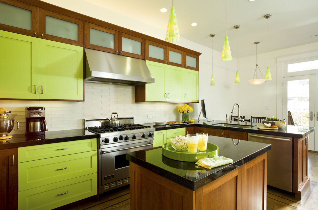
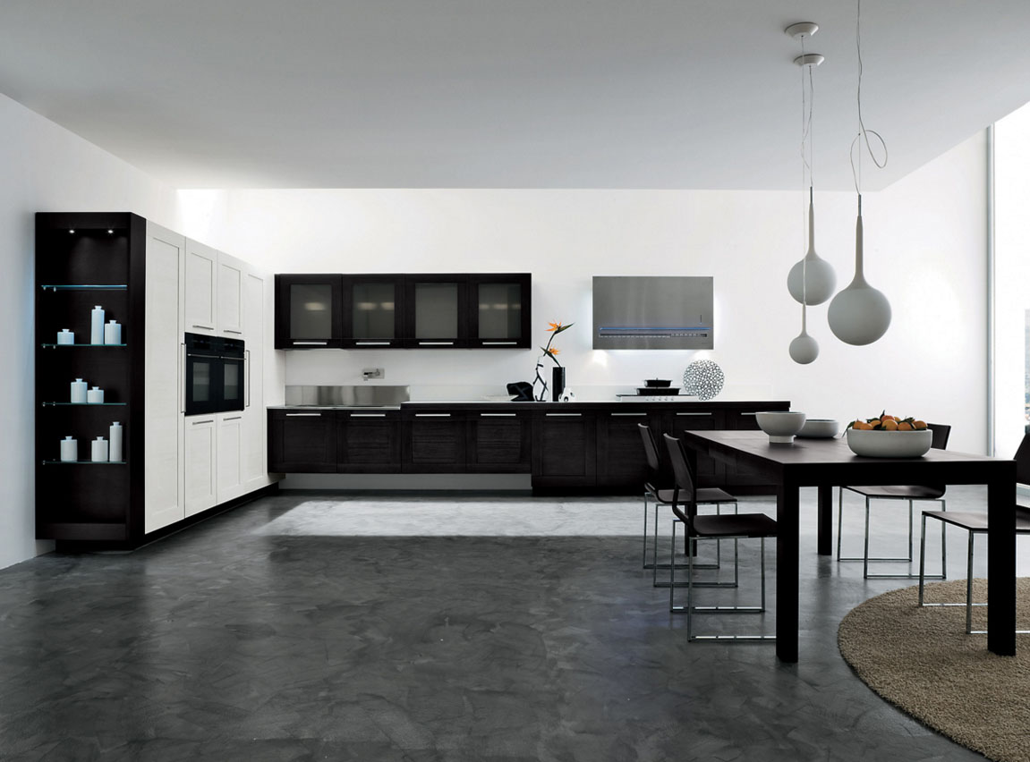
Color is permeated in the headset and dining room furniture - the overall picture on 5+
color intensity
Intensity, ie saturation - factor, on which the, It looks like the color in different light. so room, dyed in one color combination, day and night looks different.
Council! Matters and the texture of the subject. The glossy surface looks brighter (lockers, fridge, tile) Fabric upholstered furniture, eg, kitchenette - dimmer, even if they are identical in color.
Item Dimensions also influence the perception of color intensity.
There is an old inoculated, in which, selecting the color combinations in the interior, the darkest and saturated color make sex, Ceiling - light and easy. This technique helps to visually raise the low ceilings. Furniture in this case chosen in colors, medium between the floor and ceiling COLOR, in this way, balancing color proportions. The modern design allows you to mix colors, in which the saturation furniture deeper and more intense, than half, but, ceiling is invariably lighter than other interior items.
What you need to know when choosing colors:
- Pastel and bright: visually increase the room, give the impression of air. When misused bring a sense of "official".
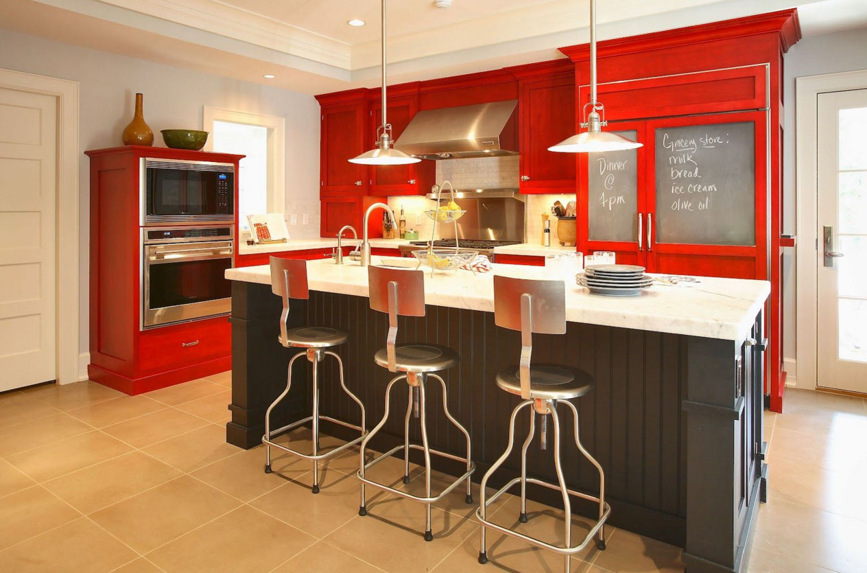
- Intense and dark: They make you feel comfortable and bring an intimate setting, optically reduce space.
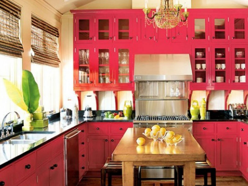
![Intense and dark colors in the kitchen]()
Young people like darker - it's very intimate - cold: calming effect, help achieve relaxation.
- warm: room seem brighter. In a dark room seem intrusive.
Rules of color combinations: tables
A place, where contrasting colors are used, It has a pronounced meaning. Fundamental rules:
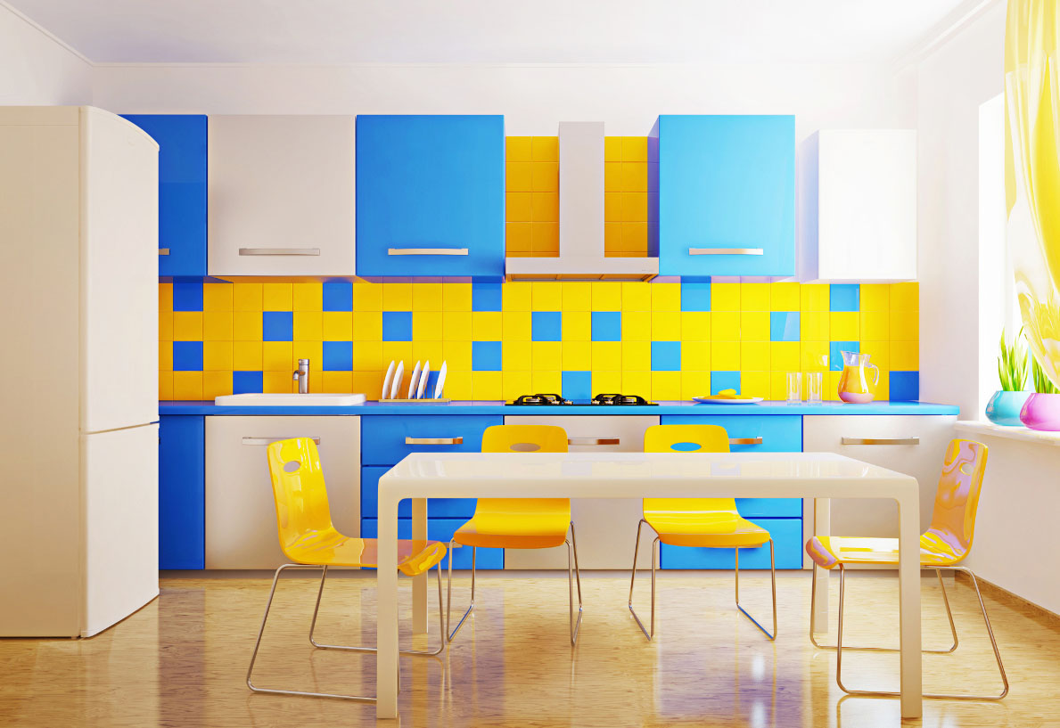
- Use contrasts to be cautious, so as not to overload the environment. example: with purple combined yellow, kitchen, Made in the violet, supplemented with yellow accessories. The main color is dominant.
- Use active colors in equal proportions is not recommended.
- A pair of contrasts diluted neutral.
- Contrasting sector is desirable to use in decorating: blinds, upholstery, decoration.
- Decorating the walls, kitchen floor covering apron and choose quiet tones.
Types of color combinations in the interior of the kitchen
Fashion on the color combination changes, the latest novelties hard to catch. General trends combine a number of approaches:
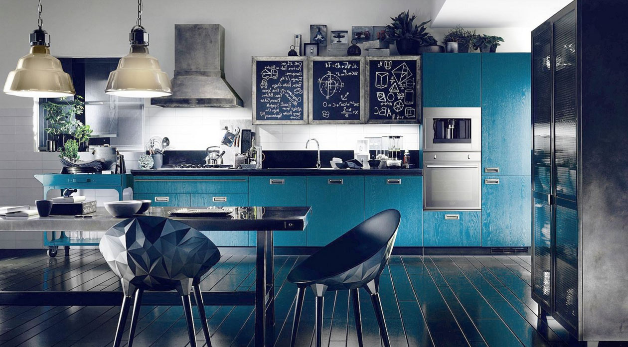
- monochromatic. The basis taken one color varies in the side of dark or light colors. This kitchen can be supplemented by small details neutral callers.
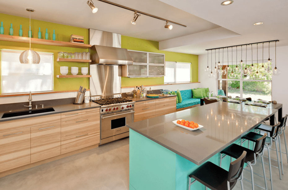
- Harmonious. To achieve the desired result will help harmonious combination of colors, adjacent circle.
- The original design is created on the game of contrasts.
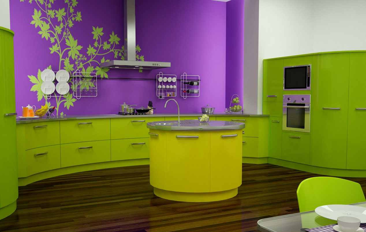
![The harmonious combination of]()
This coloring is a storm of emotions
How to combine colors in different shades: Gray, beige, green, brown, white, Orange, Violet, red, yellow, blue, blue, lime, purple, fistashkovый, olive, the black, turquoise, vinous, pink
If there is a solution, What color to draw the kitchen, determined, what colors are combined with each other:
- Dark green color - orange, cream, golden brown, salatnym, yellow, It gives the impression of merit. Light green - with pink brown, golden brown, dark blue, dark orange. Olive - with orange looks young and somewhat flippantly, looks with a light brown. Lime combined with a yellowish-brown refreshing room, with a dark blue, Red brings originality.
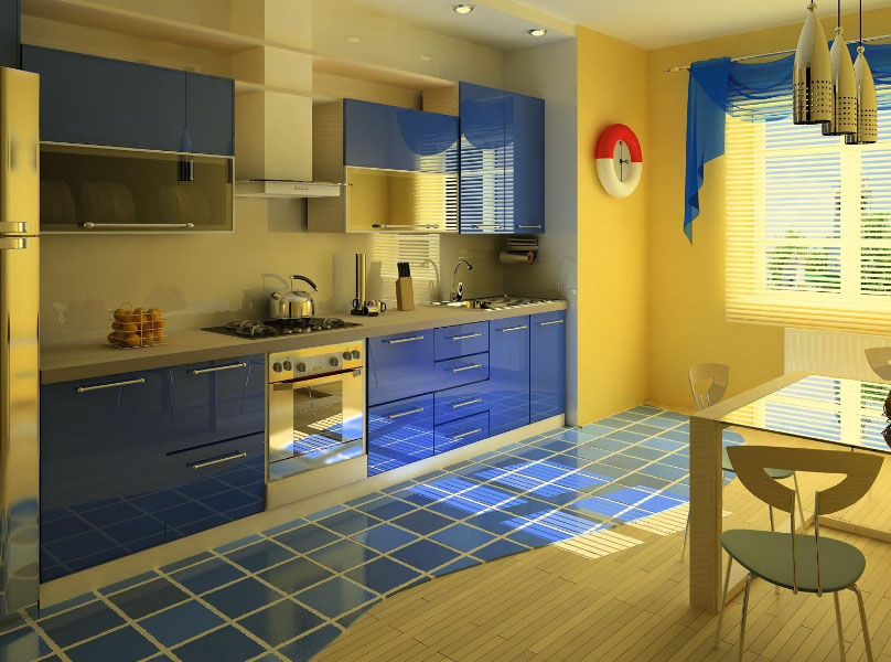
- Blue color looks spectacular in the neighborhood with a yellow and golden, with pink and red combination is acceptable, but it looks corny. Just him well with the color blue.
- With blue combines red, giving the room a kind of avant-garde. suitable green, brown, violet, yellow.
- Yellow combined with green, causing spring association, with blue, blue, black.
- Orange color combined with brown and gives a stylish.
- Pink color combined with violet, all shades of blue. This interior looks elegant, but quickly bored. for those, who often changes.
- Separately are the basic colors: White and black. These colors are combined between themselves, and with all the other. This also should include the gray.
![The combination of black and white]()
The combination of black and white- this is a classic and never goes out of fashion
two-tone furniture
A separate group in the color scheme of the kitchen design is two-tone furniture. These avant-garde design solutions were not so long ago, but surely hold niche, displacing traditional monochrome furniture sets. Beautiful combination of colors, combined with unconventional design solutions make the typical furniture exclusive. Options for combining colors are varied and limited only imagination of the designer.
Elegant classic look "light top, dark bottom ", ie, when hanging lockers lighter floor units and worktops. vertical combination, When cabinets and modules, made in different colors, It gives the impression of elegance and looks impressive. Exquisitely look model, where the top and bottom painted in one of Color, separated by contrasting counter top and added the same color accessories. option, when the island portion of the noble dark color, and stand alone cabinets, columns and countertop colors with metallic accessories to match the surface, different in style and uniqueness. Subtly blends into the atmosphere of furniture, having a combination of blue with other colors. He has a property mask the shortcomings of kitchen space. This feature helps to create a solid image, without distracting the eye to minor errors, which is impossible to eliminate.
Designs and drawings
On colored panels of kitchen furniture look beautiful patterns and designs. Small fragments decorate surface gently ornament or monogram, on-columns cabinets or mounted cabinets fit the whole picture. Scene and bulky cloth in the kitchen out of place, but floral patterns, elements of landscape or still life fit into the interior of the kitchen or dining room. There are a number of technologies drawing on furniture.
- One of the most common - blasting application. The drawings are resistant to external influences. It is performed on the glass, possible geometrical and relief patterns.
- Samokleykaya plenka PVC. When choosing such a film should look at a way to glueing. Applied to the glass surface from the inside, in other cases - outside.
- Photopolymer technology will be applied to the surface of the drawing of any complexity. If desired, the furniture will be unique, if it is to decorate a photo of family members.
- Silk painting distinguished by the simplicity of execution and, with the necessary desire, stencils, paints and tools, It can be performed independently.
- Decoupage. A simple technique, based on paper bonded, leaves, cloth, lace, other materials on the surface and securing these items lacquer.
Interesting technique decoupage cereals. Applied to the surface of drawing sketch, greased with glue, adhesive is applied to grits. After drying, it is painted in the desired color, once dried, opened varnish. These decorative elements appear in relief and gives the impression of an expensive design work, then how to perform under the force of each.