What kind of colors suitable for your kitchen
Before you start finishing the room selected style and color space. This rule also applies to the kitchen. On this depends the overall impression and psychological comfort when the kitchen.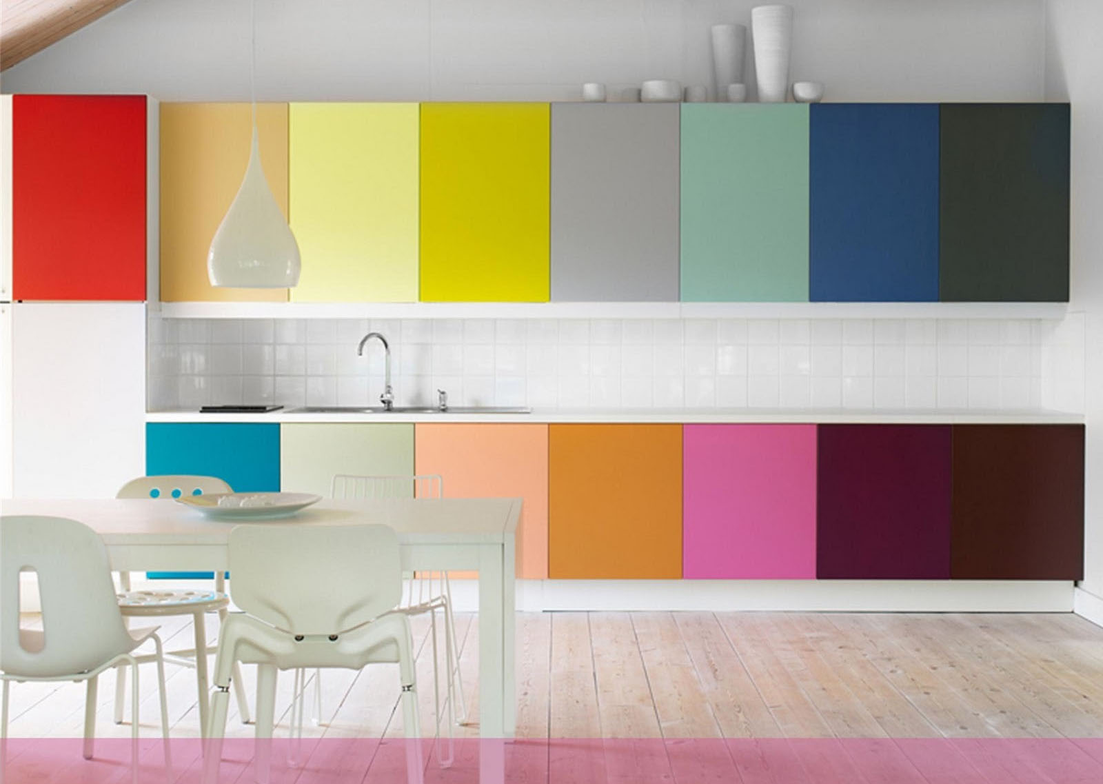
Scientists have long been proven, that colors have different effects on the human condition. Red - exciting, it stimulates the human, warms and increases the tone. Green - calming, saves energy and spirit. Yellow - creates a positive infusion, energizes. The color scheme of the kitchen affects the mood of the person and his. Therefore, this factor is taken into account on an equal basis with practicality and style.
About colors premises
Kitchen - a room, in which the whole family. One palette appetizing, other charge cheerfulness, and the third is a soothing and relaxing. The choice depends on the needs of the person, its flavor and rhythm of life. The combination of colors is also important. You need to understand what will be the main tone of the room, what additional.
Some colors make the space of the room light, other - comfortable and soft. Color kitchen design includes practical, and emotional aspects.
How to choose a color for the room
The color range for kitchen selected on the basis of the following parameters:
- hostess Preferences. Considering, that a woman spends a lot of time in the kitchen, logically, the first and decisive voice her. Cooking should not become drudgery. If a woman enjoys time, held for the cooker, and the family - happy, and dishes - delicious.
- The opinion of the other members of the family. Since the kitchen - the room, where the family gathers together at the same table, color schemes in the interior should be pleasing to all members of the family.
- The presence of young children in the family. important factor, so how to choose shades can set up a baby for a meal, create the necessary atmosphere.
- Assessment of the psychological impact of colors. As noted, color improve appetite or conversely muffle feeling of hunger, soothe or excite the nervous system.
- room Dimensions. For small rooms is better suited lighter shades, visually increase the space. Dark - on the contrary reduces space, but create a feeling of comfort and warmth.
- Window. The selection of colors in the interior affects the location of the light sources. Where little sun, make better use of soft warm shades, and the rooms, where you have to dim the lights - cold.
Another factor influences consumer choice - fashion trends. But with it should be careful. You can not blindly follow the new trends, First is to evaluate their relevance specifically for your kitchen.
exerted influence
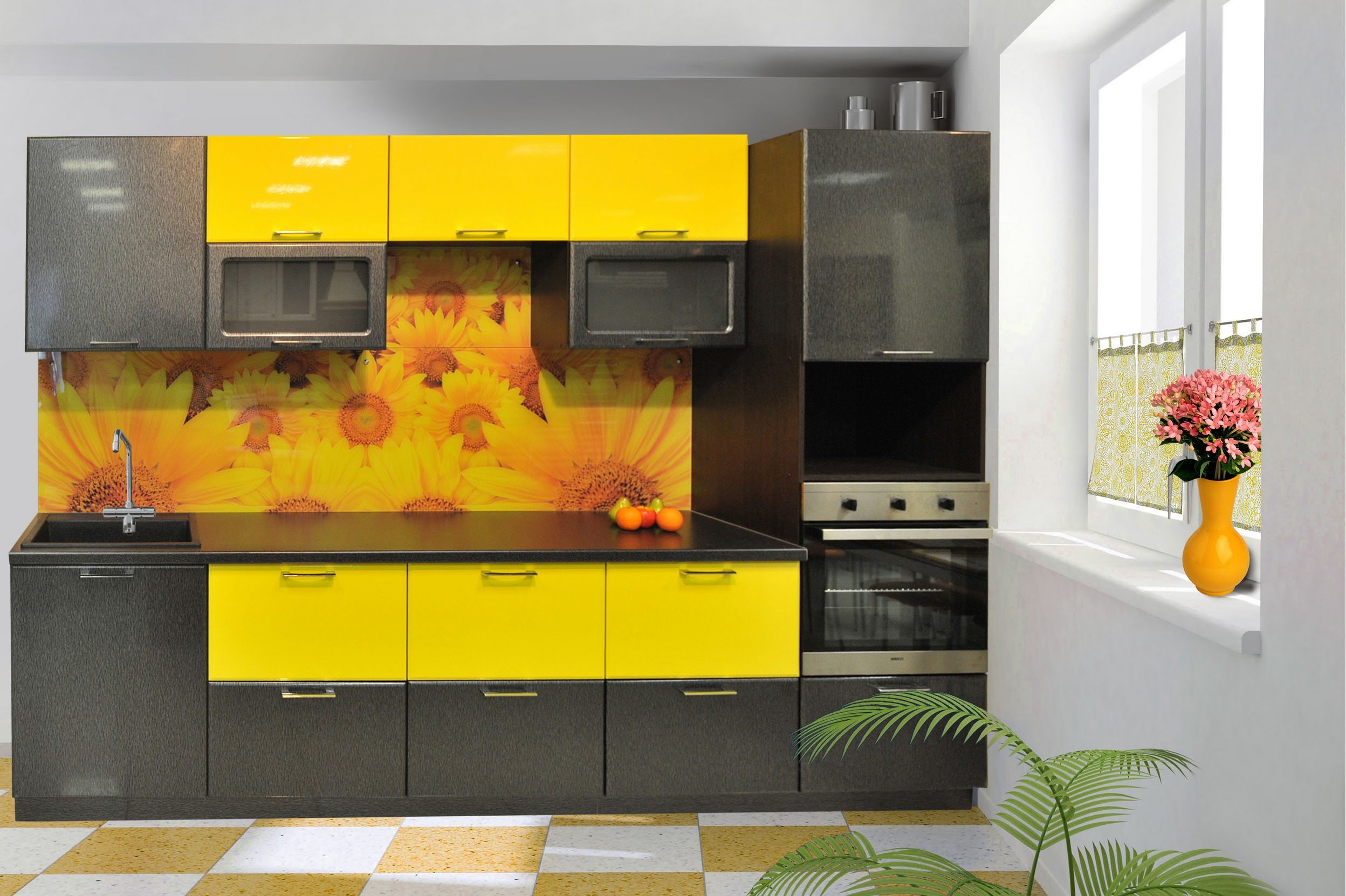
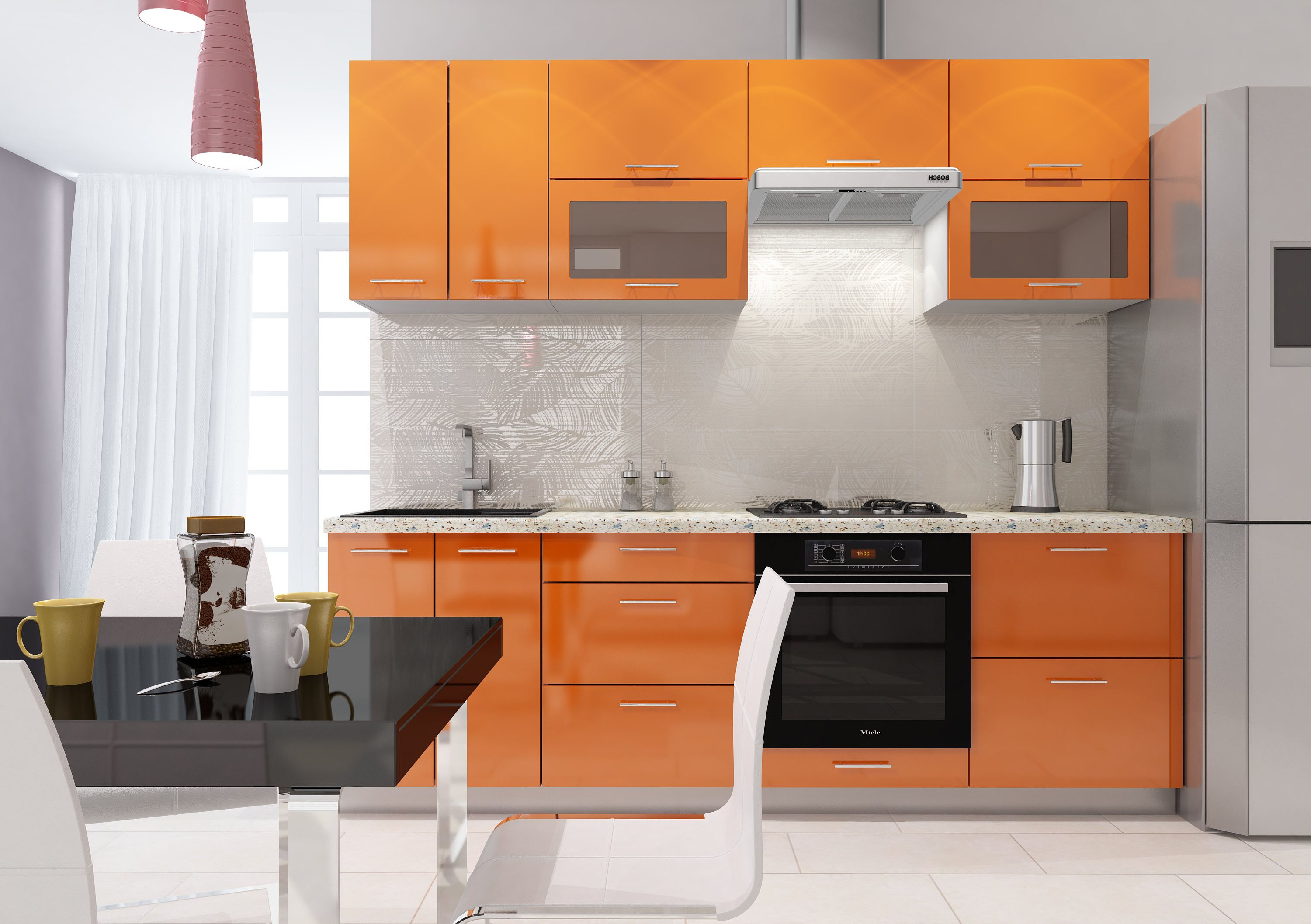
kitchen color design based, on that, it is a place of cooking and eating. Therefore, the main parameter of choice - the awakening or blunting appetite. This is important for those, who seek to control weight. What color is your appetite? All the "fruit" shades. Particularly strong impact - the color of a lemon. No wonder the mere mention of this fruit in the cause salivation. Such reflexes, and built a selection of color palettes. Almost all the warm colors has the same qualities. Including shades of green.
It is responsible for the loss of appetite - cold range. Violet, shades of blue cause no culinary associations. The color palette of colors that range includes gray and black, determining accents are used. Therefore, they are often found in combination with other shades.
Present in the palette and neutral colors, which do not affect the appetite. These include: white, fistashkovый, eggplant. Also suitable for wood-colored kitchen design.
The dependence of the color gamut of the level of illumination
What to choose the right colors in the interior, you must take into account the natural light in the room. The calculation is the number of windows, the size, focus on the light side. For small rooms suitable light colors, visually increase the area, especially if the room the lack of light.
horizontal stripes used to visually expand the room. Narrows - horizontal image. This rule works the same with light and dark tones.
Rooms can be divided into two groups:
- With insufficient lighting - windows are located to the north and north-west;
- With a sufficient level of light - windows face south and southeast.
To compensate for the lack of light, selected bright colors of the interior. Here shades act as reflectors. These colors are: white, shades of beige, light green, yellow. For small rooms the best option would be painting the panels in white. plastic color for this size kitchen, It is also necessary to choose bright.
It should be taken into account, that in the cold season, Rooms are experiencing a strong lack of light, look "cool" and uncomfortable. This will help to correct image in warm colors. This will keep the light tone of the room, add warmth and comfort.
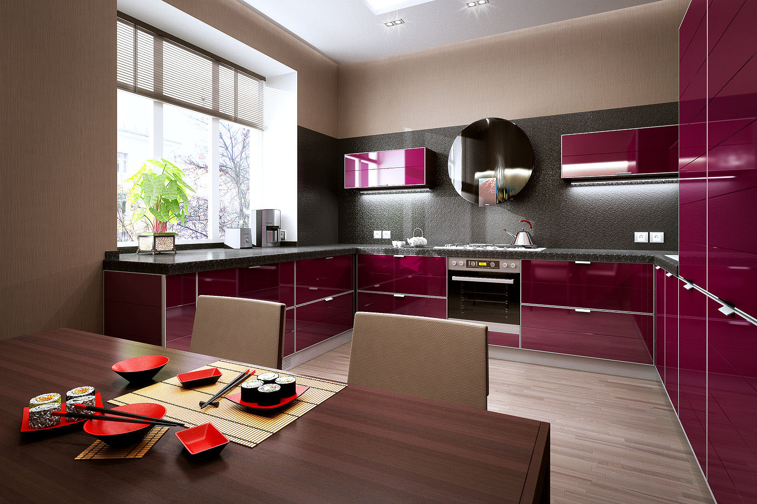
Pick up the colors in the kitchen with ample lighting easier. It uses the warm range of colors, absorbing light shades: eggplant, dark brown, vinous. Saturated red is also used for decorating kitchens. Besides, Use polished surfaces, mirrors, create an unusual atmosphere in the interior, flowers game.
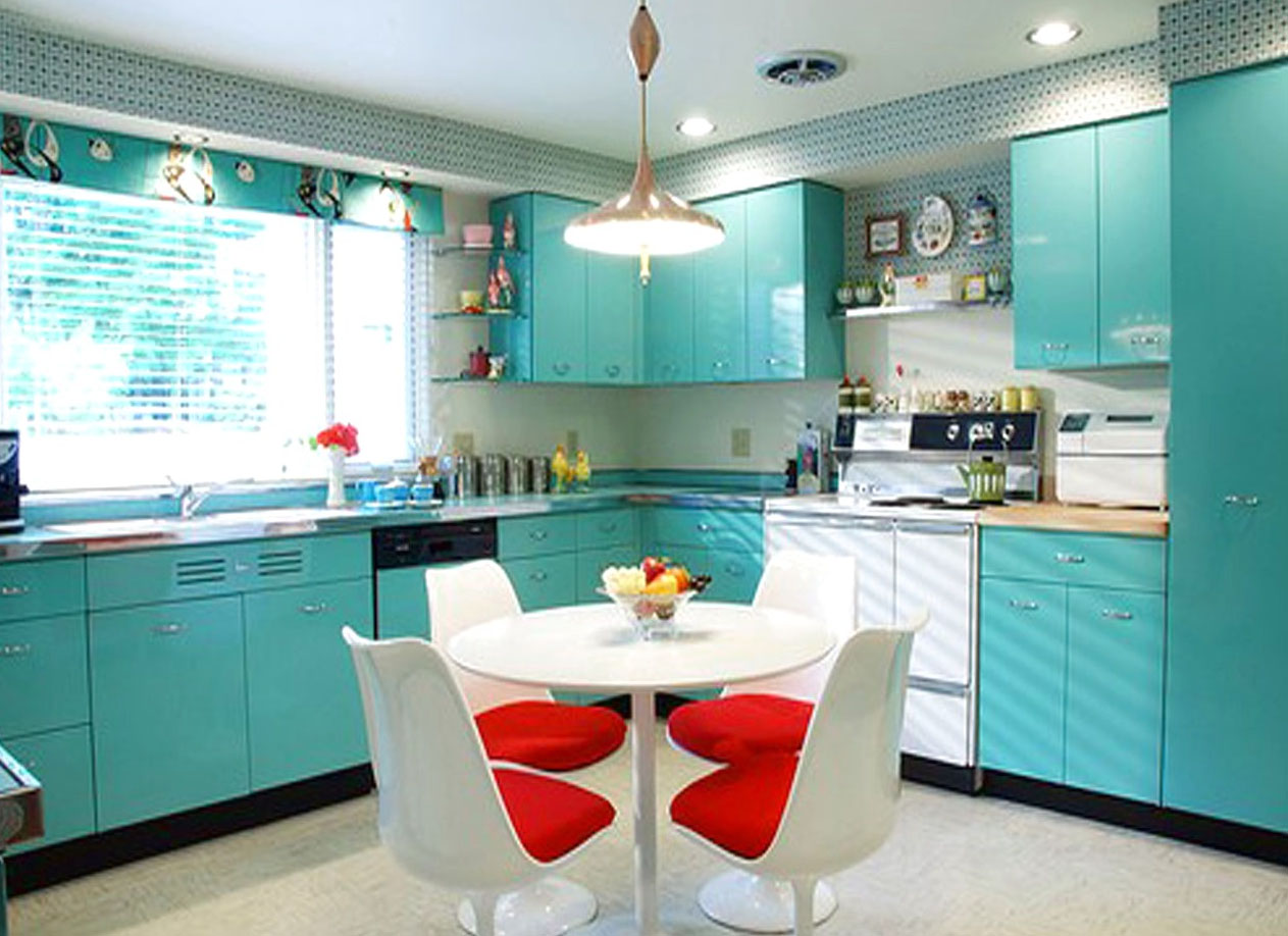
"South" room, suffer from excessive heat and light in summer. Therefore, a suitable range of colors for the interior of the premises includes cool shades: blue, light green, white. Polished surface suitable for a kitchen and a better fit into the interior.
Combinations of colors and their application
The color scheme of the kitchen is a reflection of personal preference hosts. Her knowledge will help to pick up shades compatibility. For beginners, it may seem difficult, but if we apply the following rules, then the problem would be within your power.
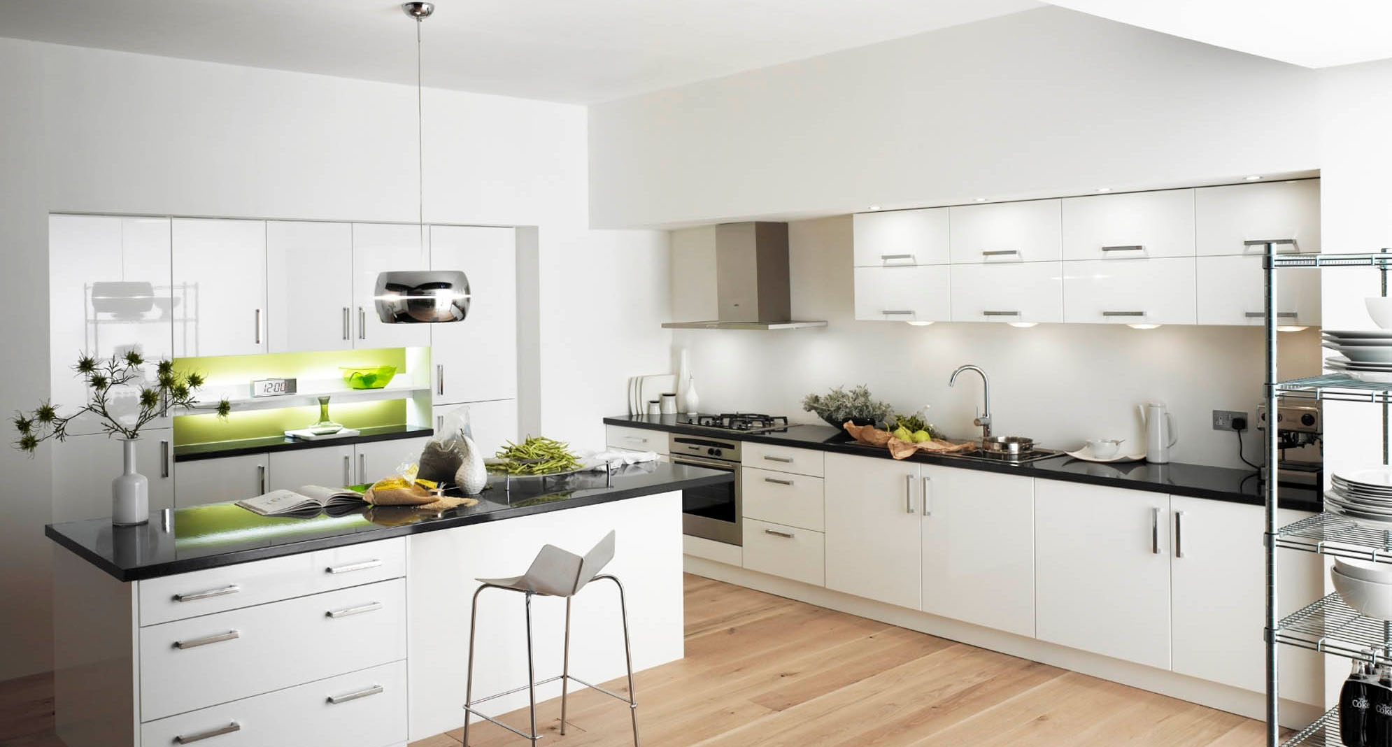
White - "friendly color. It combines with all colors.
Beige - used with pistachio, blue, brown.
gray sufficiently dull color, combined with bright colors: aubergine, blue, rich red, dark pink.
Red - suitable turquoise and olive, look with bright white and brown.
Orange - "friends" with aubergine, blue.
Brown - ideal for bright colors: blue, green, pink. Works with white and cream.
Yellow - combined with black and gray scale, blue and purple.
Green - black, yellow, warm brown, light beige.
Blue - runs to the yellow and red, looks good with green and purple.
There are basic rules, that will pick up the colors and pattern for the walls. They are equally suitable for all premises.
- Optical reducing the room to use a large image. Small - makes space expands.
- Overlapping bands create a feeling of continuous space.
- Vertical - increases the height of the room.
- Horizontal - reduces height, but "stretches" the room.
- Diagonal lines create a sense of movement.
These tips will help create a comfortable and cozy room, would smooth her flaws and emphasize the advantages of. Pay attention to the color scheme, to your kitchen is pleasing to the eye and households, and visitors.