What color is the most favorable for the kitchen
kitchen design project is advised to begin with the selection of shades. On it depends the well-being and mood of the people in the room. It is impossible to identify auspicious color for the kitchen, it prejudices. "Correctly" no shades, designers are able to create the beauty of the most controversial tones. It is therefore recommended not to select the color, and the impact, that he has.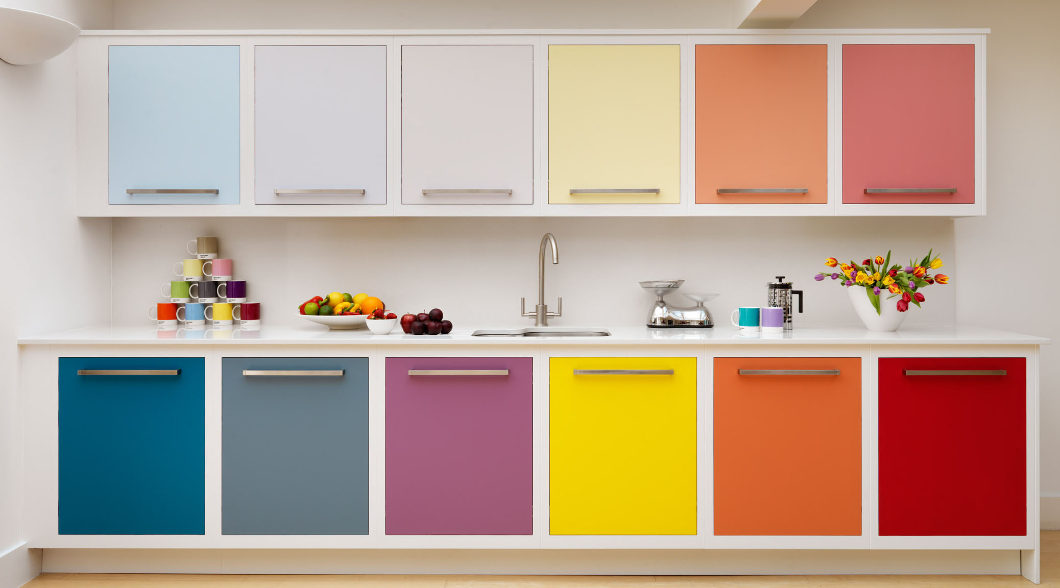
The colors for the kitchen: recommendations for selection
Colour, which will be included in the interior, better to choose in accordance with the parameters of the room. Designer isolated in this regard a few tips:
- Eliminate dark shades in small spaces, tk. they visually make them even less.
- Do not use cold tones and colors in large rooms, from this they become too impersonal and boring.
- Apply quiet shades, If the kitchen is poorly lit.
- Eliminate saturated and bright colors with abundant sunlight.
- White - Universal Tone, used as background, or released details.
Need to think about the combination of colors, tk. palette - shades of the totality. There are three schemes. contrast is based on a combination of opposite colors on the spectrum. Playing with depth, create active or passive exposure.
Analog circuit involves the use of similar color range. Suitable for small-sized kitchen.
And monochromatic scheme based on the application of one color, but in different shades. A complex system, under the force of experts.
Red
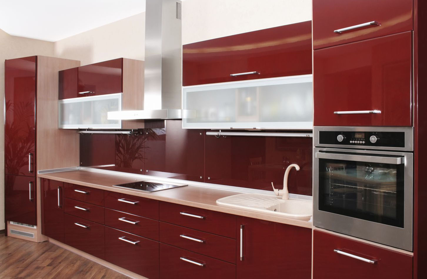
Red stimulates the appetite, increases the pressure, It gives confidence. Tone selected expressive personality, capable of spontaneous action, acts. probably, impulsivity makes a choice in favor of the red
designers believe, such a tone appropriate for the kitchen, but not for those, who adheres to a diet. In this case it is used in the details or accents.
White approaches the red, as well as metal. The first is reasonable to paint the walls, the second is often found on the surfaces of household appliances.
Yellow
Yellow and shades - suitable colors for the room, where friends and family gather. Designers recommend to use them as the main, tk. they are associated with warm, sunny morning.
Tone is able to lift the mood, invigorates. It has to experiment. But too rich it causes irritation and anxiety.
Orange
Orange can be used in parts or accents. Basically it looks too pretentious and bright. Even a dim light is not able to eliminate this effect.
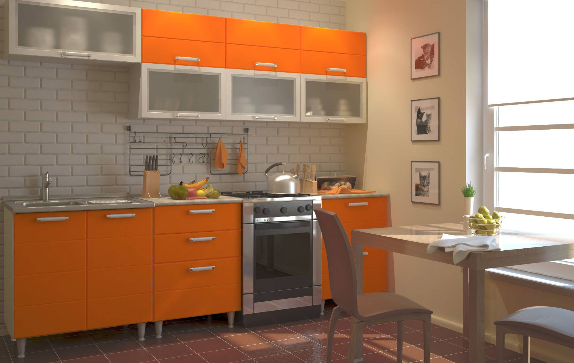
suitable color for mobile natures, He has to act. Therefore, it is used in fast-food establishments. Quiet chat with friends, Orange relatives will not allow.
Green
If a person is nice to be in the kitchen, Green means there prevails. Tone pleasing to the eye, It does not strain your eyes, It gives a sense of security. It symbolizes life, nature, therefore adjusts for relaxation, appeasement.
Green is suitable in the case of, if a person experiences physical or mental stress. It helps to deal with stress. psychologists say, tone that minimizes the pain.
Blue
Choosing Kitchen blue need the, who have long been dreaming to lose weight. He subconsciously associate a person with missing vegetables, fruit. Therefore, in such circumstances, there is no want.
hue-sufficient. If any other color suits to blue, only his colors - blue or indigo. Also shade accentual, it can not be used as a background. Poorly maintained he and decor elements.
White
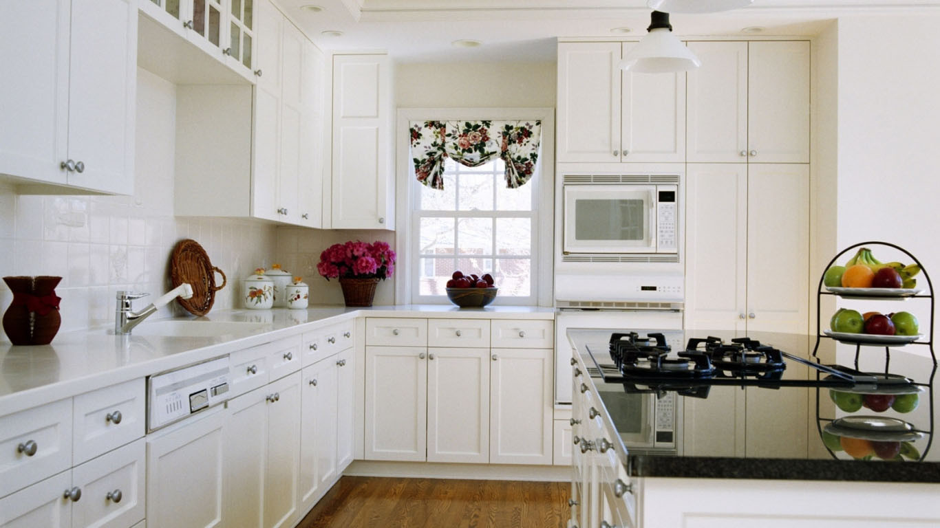
The clarity and purity of the white color means. there is an opinion, that it has a positive effect on appetite. But excess is able to tire. If the inside gets a little light, then it looks gray.
White can be used in compliance with the rules:
- The use of glossy surfaces, reflecting other shades. Then lost to annoy the rigor and clarity;
- Using a plurality of light sources, to avoid the appearance of dullness. Good, If the sun's rays penetrate inside;
- A variety of interior décor and fittings, seasoned in different colors and shades. Then, eyestrain is reduced.
Black color Ideally suited to white. Created and sustained severe space, able to improve discipline. Therefore suited scattered individuals.
The bright color of the walls under the white kitchen can dilute the interior, make him a sense of joy, elation.
The black
Dark shades - dangerous for an inexperienced person. They symbolize mourning and night. Correctly chosen framing able to make it stylish, contemporary.
The main advantage is versatility. Any color suits to black. It allows you to experiment with the details and accents. Black and white kitchen - a classic, but adding it striking elements, creates dynamic interior.
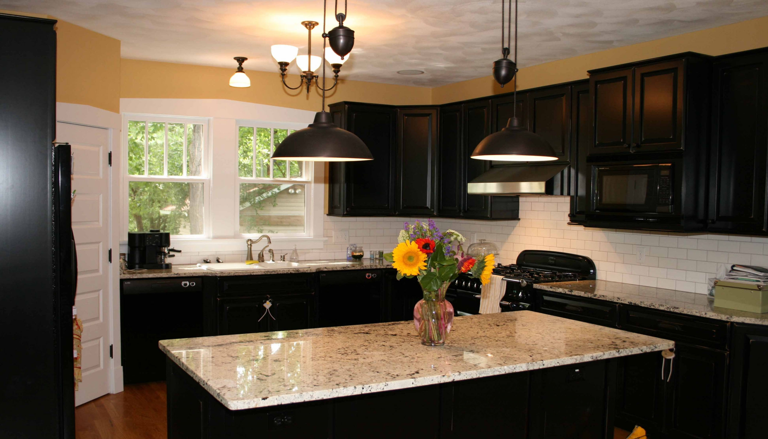
designers believe, that the use of black color in an atmosphere or decoration gives the project a finished look. Therefore, they are safe to use it.
color combinations
Bright red or blue color of the walls for the kitchen, if the furniture is done white, pastel. in front of, beige wallpaper combined with classic wooden suite.
The main thing - the more unusual kitchen furniture (the form, invoice, shade, etc.), the calmer should be wallpaper, without pattern and ornamentation, to the interior did not look pretentious, flashily.
When the headset is held in one color, it necessarily need to emphasize the bright walls, or decorative elements.
Furniture design is also important. If it is a rustic, the walls crumble in subtle shades. When he was a city - then the wall will be bright.
Inlay has a value, but not so important, as furniture. It is unnecessary to think twice, what color should be in the kitchen utensils. If its shade does not fit the style or tone, it is possible to hide in lockers.
The kitchen is recommended to keep close by the tone of colors Headset, other furniture, decoration, they uniquely blended together.
Selection of interior design project you need to make informed, after weighing all the pros and cons. If you are using "sophisticated" color, then it is better to heed the advice of professionals. Now you know, what color for the kitchen.
