Orange wallpapers for the kitchen: the pros and the nuances of such registration
Selection of colors - one of the most important moments in the preparation of a design project for a new interior. Kitchen is a good option Orange color. It is used in the design of walls, textiles, furniture and various decorative details. It is important to choose the successful combination of colors, to emphasize the dignity of the chosen hue and counterbalance its effects on human.
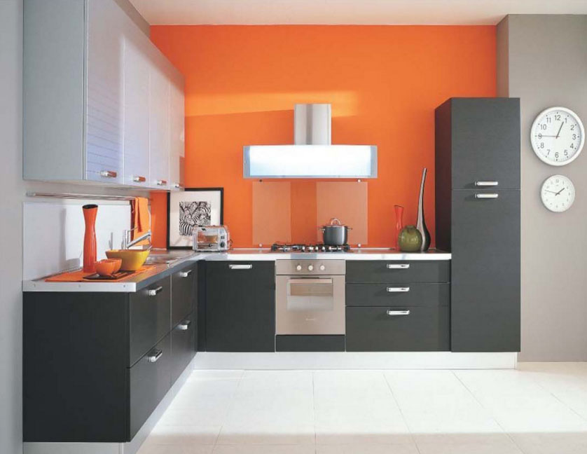
Wallpaper orange color in the interior of the kitchen
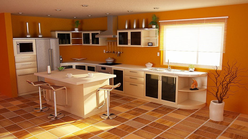
The walls of most affect the perception of the interior as a whole. That is why it is worth paying attention to the orange wallpapers for the kitchen. Bright, saturated hue evokes emotions and energizes. Since it is in the kitchen with a breakfast begins the day the majority of people, This option is perfect for a modern repair.
The paper used as the familiar rolled materials, and wallpapers with a complex pattern. They can choose from a catalog of finished products or make to order. For this customer selected desired pattern and transferred to the paper sheets by the large-format printing.
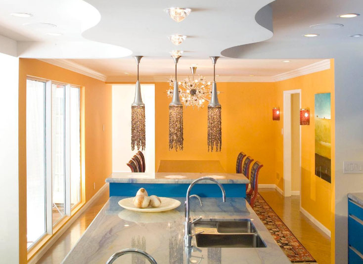
The most successful and very popular option are the Mural "Oranges". It is recommended to supplement their real citrus fruit on the table.
What shade to choose for the refectory
There are lots of colors in orange palette:
- peach;
- pumpkin;
- salmon;
- Variations coral;
- tyerrakota;
- bronze;
- mandarin;
- ocher;
- apricot;
- carrot;
- amber;
- gummigut;
- redwood, etc..
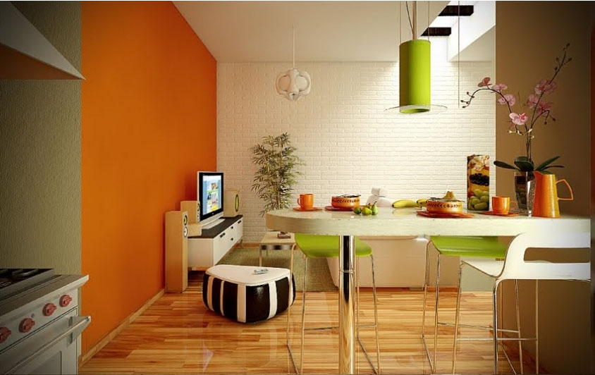
It is a very popular design coral color. This shade less bright, and therefore softer impact on the psycho-emotional state of a person. He is close to the red palette, so as not to cause irritation of the best to consider for the design of the walls pale coral color. Also suitable salmon, peach and apricot. To create a cozy interior dark wallpaper using gamboge or Mandarin.
Pros orange wallpaper
Not all people are enthusiastic about the idea to make the kitchen orange walls. All the matter of personal taste and the ratio of colors with features of human nature. You also need to take into account the characteristics of the premises, which it is planned to repair. To maintain the idea should be to determine what benefits are orange walls in the interior:
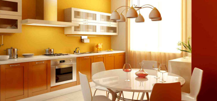
- Waking invigorating effect. On the morning of this property is no price. This color energize you for the day.
- Improves mood. Solar range is suitable for active people cheerful. For pessimists is this kind of medicine, customize their view of the world in the right direction.
- eupeptic. All warm palette has a positive effect on the digestive tract and increases appetite.
- Suitable for children. The younger generation loves bright colors, In addition, they contribute to their intellectual and psycho-emotional development.
- It stabilizes the cardiovascular system. All shades of orange stimulate blood circulation and activate the system SS.
- brightens interior. Bright colors enhance the lighting effect.
Plain surface for painting, Ready wallpaper with a pattern or printing - all options are able to exert a similar effect. The maximum positive effect is achieved by properly combining the other interior elements and arrangement of auxiliary accents.
design nuances
Because of its specific perception and diversity of the palette of elements necessary to take into account some of the nuances. Most of the questions is a bright orange color. He has a stimulant effect on the human psyche, and therefore when there are an abundance of hunger, irritation, giperaktivnosti etc. With a constant presence in this room a person mentally exhausted. For those who want to lose weight the effect of appetite awakening - not the best assistant.
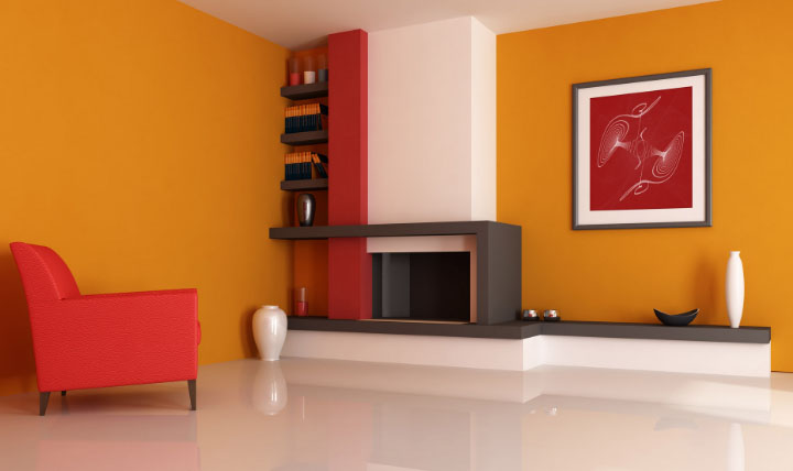
To balance the situation, instead of processing the walls a bright color, use soothing colors. Instead of wallpaper, hang small pictures orange, buy the appropriate textiles. When this shade tired, just replace the decor in the room.
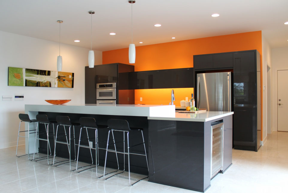
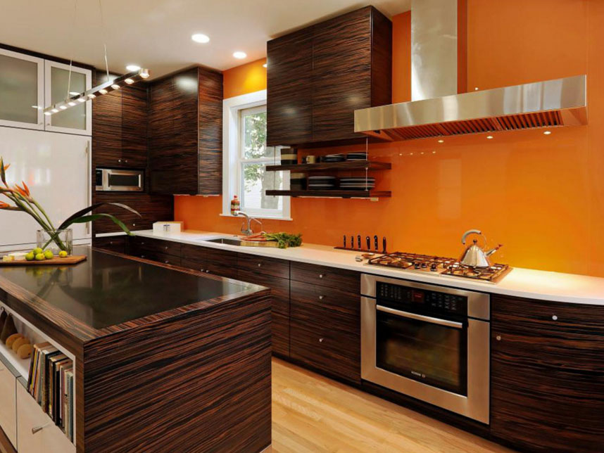
Some like to orange in kitchen. With this wall furniture must be neutral, not to merge into a bright spot with furniture. Better to turn to an achromatic scale: the black, white, Gray. Kitchen design with orange suite - a selection of modern active people. Stylistically it no longer refers to the modern, high-tech, minimalism, as well as the avant-garde trends - fusion and kitsch.
Alternative - bright apron above the work surface. For it is possible to use ceramic tiles and mosaics, Mural Oranges for kitchen, colored glass, plastic plates, etc.. It is interesting to see the photo composition with flowers, Autumn landscape and sunset on a tropical beach. note:the color of the clouds in such photos. Another unusual variant - an imitation brick and terracotta.
Successful combination with other furniture suite and
You can not use a palette of colors for interior design. It is necessary to find out which color suits to orange. Conventionally, they are divided into such categories:
- achromatic;
- neutral;
- warm;
- cold.
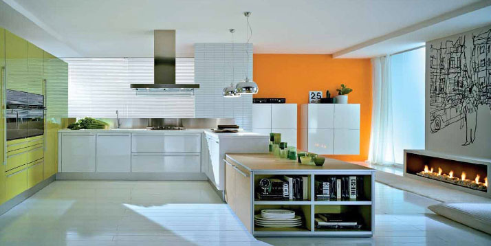
To apply the achromatic white and black, as well as various shades of gray. Apron for a black and orange background - perfect. Bright "orange" takes on a dark background of a particular saturation, but this is balanced. It is possible to use combinations of facades or make to insert doors.
To the neutral category includes beige background. It can be warm or cold, Depending on the shade. Better to give preference to the first embodiment. If you do just bright walls, eg, using coral color, suitable lactic furniture made of MDF or plastic. For a classic interior fit bleached oak, light wenge, ash, light shades of maple, beech, alder and elm.
It refers to a neutral green. In kitchen orange color combined with green, hrushevыm, mint, If you want to create a soft light interior. For spring mood suited lime, avocado, forest green, and for the rich palette of muted - emerald, malachite, olive, khaki, fern.
From the cold group is a fine blue and blue palette. Coral color in the interior blends better with purple. Considered ideal amethyst, wistaria, indigo, celestial blue, vasylkovыy, water Bondi Beach, sea wave, jean.
For small spaces, choose lighter shades, as the dark walls visually design shifts.
It looks good coral color in combination with purple. They also include an orchid, pale purple, violaceous. The warm tones of yellow and brown welcome. Yellow and its variations paired with orange require neutral background. Dark colors lend coziness, especially if you use natural wood shades: wenge, nut, oak, ash, mahogany or mahogany.
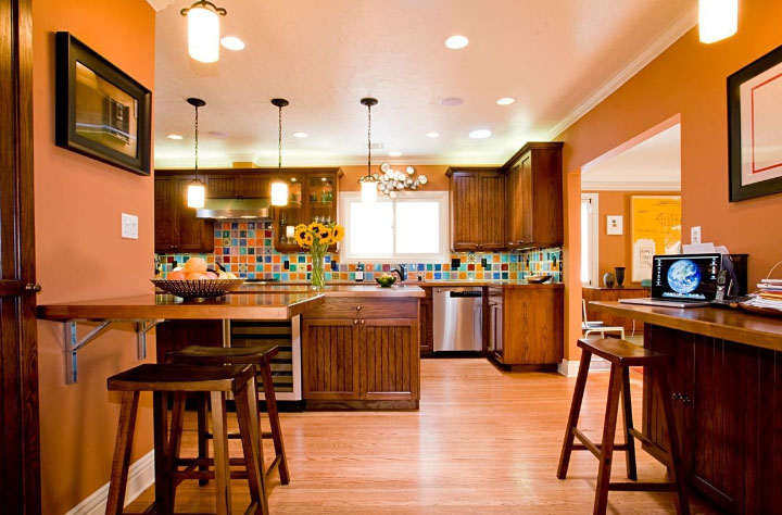
Of the additional registration is successful variant tulle peach. Gentle tones soften the "orange" and clarified the room. To create comfort in the classical kitchen will approach the dark heavy curtains or blinds. Brass or terracotta shades in the interior of the window allocate zone and take the attention on himself.
When choosing a design project in orange tones need to think carefully about every detail of the kitchen. You can not focus on one color, otherwise the interior will be taken seriously and quickly tire owners. Light should be contrasted with the dark, rich - with a pale. Be sure to add support accents in the form of textiles, crockery, wall decor of a suitable palette. If the walls are plain hang photos of exotic fruits, green apples, flowers with a dark box. If the wallpaper is already contain a drawing or abstract pattern, do not overload the surface details.
If the plan does not work on their own situation, use the services of a designer or consider ready-made examples of such interiors.
