Black and white of the interior Kitchen: design
Fortunately or unfortunately, black-and-white decor in the Russian kitchen is not common: someone sees it too gloomy, and someone annoys a bright contrast. But regardless of the customers' opinions, design space duo of colors gives classic elegance and restraint of visual space. However, today's trend - minimalism and it determines the format combining into a single black and white whole, and black-and-white tiles on the floor - not the main protagonist of the interior.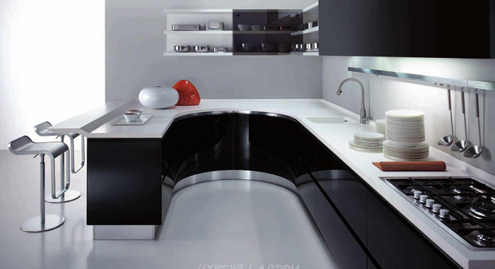
What is good design in black and white? The quintessence of the composition - it expressivity, felt in every detail. Monochrome room pulls out his visitor from the routine and plunges him into a world of strict, but beautiful geometry, definition of forms and fills every second the feeling, that you are "here and now". Texture with a contrast of matte and glossy create a unique sense of fullness in the room while maintaining its lightness.
In this article we focus on the basic elements and methods, are worth considering, if you decide, black-and-white kitchen would be the best solution in the regeneration of a modern apartment. We will touch on questions of style, t furniture, light and small decorative elements. so, proceed!
Yin and Yang in the style and design - professional advice
As we have said, modern trends in design are simplifying decor elements, reducing the number of small parts, by minimalism. However, black and white combination includes a hi-tech, then the question comes down solely to the choice of equipment and furniture. This contrast becomes important in the flow of the avant-garde and art-deco, change only little things.
You guessed it, background color is white kitchen. Black excessively overload the space, a clumsy combination often creates a pressure atmosphere, so you should use black dot, not taking him under too much space: tiles in a checkerboard pattern will look much more attractive and "easier", than subfloor in the kitchen.
Radicalism in the style of cuisine is simply out of place, so do not forget about the other colors, because an excessively large monochrome segment is represented as a hollow, so - lost.
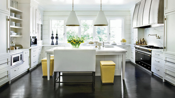
before, than translate the dream into reality, pay attention to the light in your kitchen. If you have to include even in the daytime lighting, the kitchen design in black and white is not the best solution, Only natural light creates the desired effect of volume and color depth.
Alternatively use point illumination of the working area, or conducted under the ceiling - in place of a border - spots with small and powerful spotlights to create the effect of fill light. By the way, you can make yourself fixing color, than the ceiling, that will go to the wall, especially, if you decide to make a black ceiling in the kitchen, although making it monotonous is not the best solution.
White kitchen - black furniture: whether?
Domestic furniture manufacturers, smooth, as well as their foreign counterparts, prefer white kitchen, at least - completely black. This leads to the, that the whole design black and white kitchen is reduced to two contrasts: dark room and light furniture. Such variant looks, to put it mildly, baldly. One of the rules of registration, which should equip - contrast should be observed not only in the room. By purchasing the white kitchen cabinets, note, to the top was black - the contrast should be in the details: white top, black bottom.
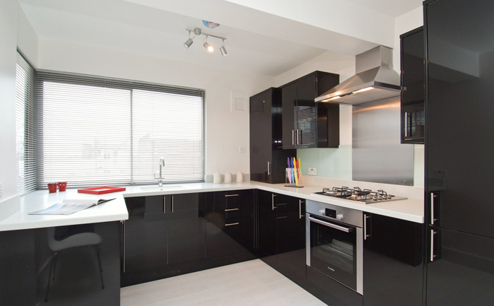
Deciding to purchase the basic furniture in black, should consider the approach to the flooring. Leaving the bottom fitting black, should abandon the idea, subfloor in the interior of the kitchen will be concise solution.
Minimum, it is worth considering that in this case,: centimeters from the nearest bottom fittings must be white.
The overall range will fit tile floor white with black accents, of which creates a specific pattern. Budget embodiment - two-color black-white tile with diagonal dividing, option premium - custom tile with a specific pattern.
Black and white kitchen - design and finish options
In the previous parts we have identified the main directions for decorating black kitchen, immediately reduce the important tips in a small list and let important points for further discussion.
wall design
The walls are kept in a pale white color, suitable for pasting wallpaper with bright dark abstractions, as an option - textured wallpaper. In the style of hi-tech wallpaper fit, stylized "bruising" with texture folds.
Not necessarily use the same wallpaper on every wall: on the wall, for which there is a kitchen fittings, reasonable to use black and white wallpapers, which will occupy the free space between strip tops and shelves mounted.
If desired, the working zone, third color apron can be used instead of wallpaper. Since the need to maintain the brightness of style, apron black and white kitchen is recommended to do red: catchy and attractive.
set
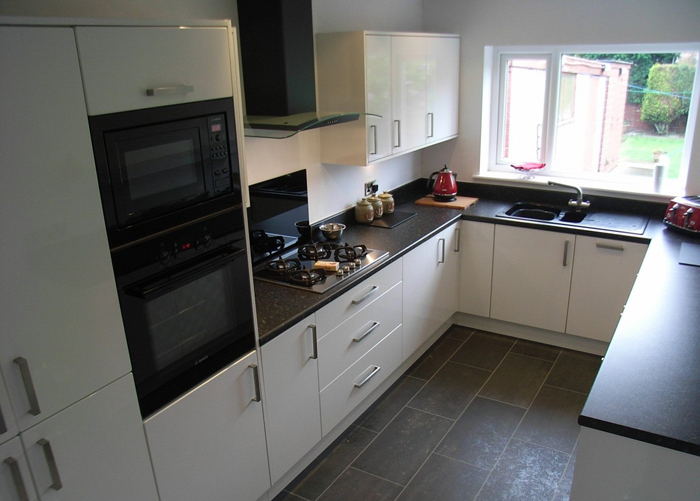
Using a light set in the work area, designers recommend to give preference to black worktops. Permitting style, It is permissible to use an artificial stone, as a coating material for countertops, and for additional light black glass chandelier in the interior of such kitchen wakes logical complement.
Considering the practicality, you can leave the table top white, but one zone (often this zone, adjacent to the plate) should do black.
First of all, You do not have to constantly wash the work surface, Second small, but the sharp transitions in black white add charm. For this reason, some cooking zone used black tiles on the floor.
Dark dining group
Consider the choice of black table and chairs, preferably of thick glass.
Such a decision would kill two birds at once: glass hundred and easy to wash, and the black color on the background light walls give the space field. As an option, refectory sometimes zoned area, Using black and white tiles in four bars.
floor clearance
Here, you only limit is your imagination, the floor can be done in light and dark shades. White floor requires constant care, and the soon to remind hospital tiles.
An acceptable solution will be black and white floor tiles with whole pattern, the only thing, what you should pay attention - this figure has;
Kitchen in black and white require some field lines, It would be logical to prefer drawing with acute and right angles. The floor can provide a neutral and use the white laminate in the interior of the kitchen, or to prefer light sandy shades.
Interior
Interior black and white kitchen allows you to decorate the ceiling and black materials. With his design should avoid any figures - they will inadvertently strike the eye, that soon pall.
Doing ceiling black, do not forget about the transition to the light walls. Here it will suit already called transition method using lighting, a play on black and white pattern top of the wall.
Harmony in the wallpaper: adhesive style
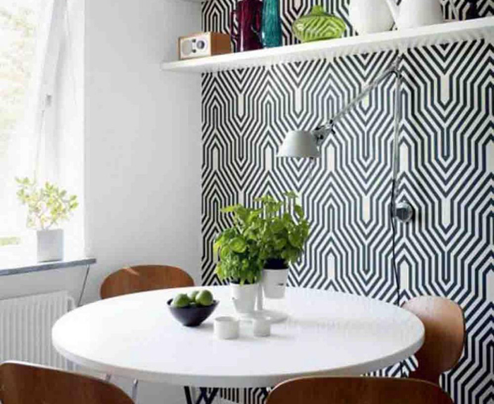
For small spaces, choose wallpaper with a large pattern, draws attention to itself. Should be avoided and a clear geometry patterns, for small spaces - the murder, this arrangement reveals a real lack of space and the room narrows. To expand the visual boundaries using abstraction, choose fuzzy and blurred picture.
for kitchens, area over 10 m. permissible black and white wallpapers. Cities, such as the pattern on the wallpaper, visually alienate Wall, adding lightness kitchen, and even have the kitchen a little New York is also nice.
On the plain white walls will look beautiful small black-and-white photographs in black frames. The subjects of the image depends on the style of cuisine, but mostly urban landscapes.
Here are some frequently encountered solutions for decoration of the walls:
- For the most creative: use separate stencils dark patterns on light walls or wallpaper
- Using a large number of decorative stickers on the walls.
- Wall stand in muddy and white, which are a little different from the rest of the white well in the kitchen
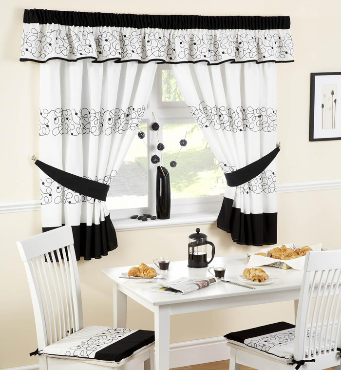
Basically, any finish on this kitchen looks attractive, and all, What you should avoid, so this pettiness in the patterns, because she has a sense of "viscosity" and "gravity" of space. In addition, the following fines may be added to the design of walls:
- Large windows large pattern curtains. Choose light curtains with large dark pattern. In priokonnoy attractive area will look white tile with black accents on the floor, eg, black "crumbs".
- Small elements of the situation: dark wall clock, Black glass bowls for fruit, if space allows - a large vase with a dark artificial decorative flowers. Plus the fact, that the little things are always easy to replace.
- Change the background color. When a light background color of the walls, put it on the floor in black. Make it easy: in the center of the kitchen is used, forming a square, black floor tiles, then use the alternation of bands with increasing white tiles of the same in the square and up to five of the wall. In the kitchens of irregular geometry is used with a white tile floor black squares, to create a complete form outdoor ornament.
The third is not always an extra
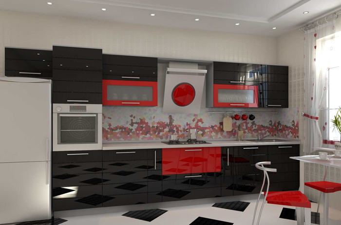
Choosing complementary colors depends on your desire, but it is not necessary to breed a riot of colors and go beyond the three additional colors. The most common color - rich red.
It is used in the general decor (as an apron), but it is permissible to dilute the working and dining space. In the triad of black-white-red appears quiet romantic note.
The blue color is preferable to use tissues: towels, tablecloths, coasters for cups is a complement and a little "cool" kitchen. What is not less important, black-and-white furniture against a background of blue specks looks sharper, but slightly loses in size.
You can experiment with other colors, but it is important to understand, the third color should not be unduly oversaturate basic tone, Avoid Nuclear shades, hard-hitting on the eyes.
Finishing touch: kitchen apron
If no color is selected for the third apron, when you select pay attention to the dominant color in the kitchen: Black Apron Kitchen is selected by leading black, white (beige) with a predominance of white. In another palette designers call to abandon the identity of these elements, but the black-and-white interior pushes beyond what is permitted.
To sum it up, that we have touched only the cornerstone of the black and white kitchen design. Our main task - to help avoid common mistakes in selecting interior, but do not offer the reader the finished project. We hope, that familiarity with the article was helpful to you. Here's a he, black and white kitchen design.
