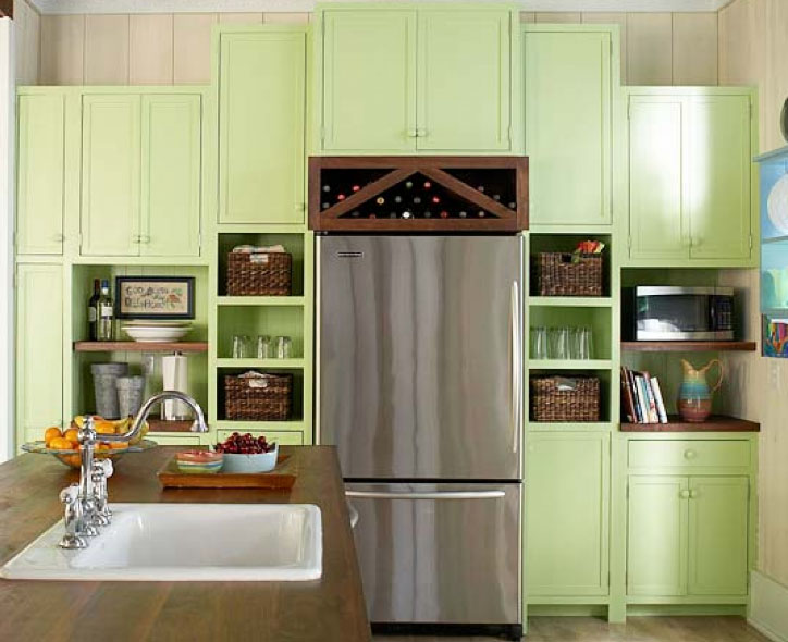
4 advice when you make a kitchen in shades of green
kitchen interior atmosphere has a direct impact on the general emotional background, prevailing in the apartment. Kitchen - is not only room for cooking and family gatherings, This imprint philosophy of life of its mistress. Modern life is replete with vivid impressions and experiences, and this is reflected in the style of the design of their personal space. A formal approach to the design of a kitchen interior was replaced by a conscious approach to the space zoning and the use of rich and saturated colors.

Influence of green health food
Psychologists have long studied the effect of color on emotional state: M.Lyusher, Itten Johannes demonstrated an association between human psyche and the spectrum of light waves. The influence of color on the human body great, he is able to change the emotional state and physical well-being.
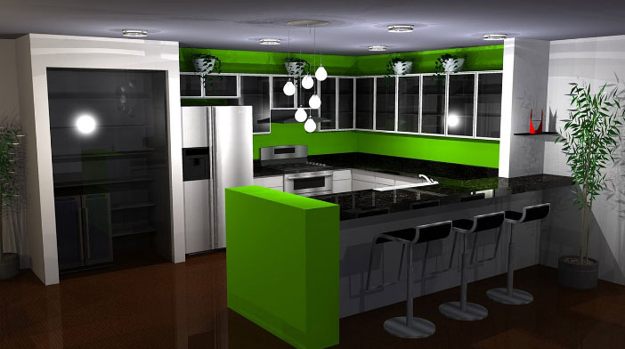
Green refers to the archetypes, causing positive emotions. Formation of human organs took place in an environment, characterized by an excess of green spectrum. At the genetic level, the prevalence of this color in the environment has a calming effect, since it corresponds to instinctively programmed notion of safety and comfort. The human body reacts to the color on the principle of "no danger", since it corresponds to the natural habitat.
At the physiological level, the green color can have a hypnotic effect on man. Cabinets psychological relaxation performed in subdued green shades, which increases the effectiveness of treatment of irritability, neurasthenia, insomnia and chronic fatigue. Malachite, mint color relaxes the parasympathetic nervous system, whereby the pressure is reduced, dilate blood vessels.
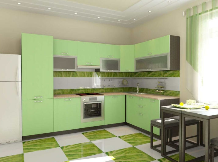
Cafe owners know, as much as possible with the help of green to make a cozy and homely atmosphere and use it for decoration for customer retention.
It is under the constant influence of the spectrum, It increases a person's ability to long and repetitive muscle activity and concentration. In contrast to the red spectrum, capable of causing short-term, sprint energy bursts of high amplitude, Green awakens in man the ability marathon.
Mint color in the interior improves appetite, so for those, who have problems with being overweight, from the green in the kitchen should be abandoned.
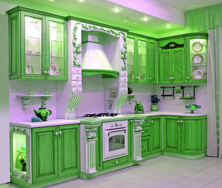
Tips in interior design from the suite
there are rules, according to which it is recommended to design
Kitchen design in green:
- First, we should choose kitchen furniture. In accordance with the lower and upper row of cabinets and countertop selected coloring apron, and in the last instance determined tinted walls.
- green shades are selected, depending on the size of the kitchen. For registration of surfaces in large rooms bright colors, such as lemon color, bright salad, do not use. For background take darker shades - malachite, needles or the color green mint, and apple and acid-green color is used to create small accents, eg, to isolate the dining area or the working space near the sink.
![mentolovaya kitchen]()
- On color perception in the interior of the kitchen room lighting affects and. To darken the room is better to use bright shades of green. In a well-lit room with large windows, they cause irritation, so in this case the best option would be mint kitchen, in the colors which are used green tone with blue hue.
- For each design style uses its own color scheme. Classic style, suggesting severe forms, It requires the use of subdued colors with deep texture. The high-tech use of bright colors is the main tool in the implementation of original ideas.
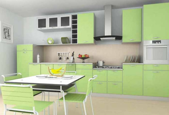
Apron is located at the junction of two levels of rooms, therefore plays an important role in his spatial perception. Here are some tips, concerning the registration of Green kitchen apron:
- Bright apron will effectively be combined with white or black background. Depending on this radically different perception of green. Black background adds richness, and white makes it brighter.
- To apron looked expressively, green walls make a paler.
- It is recommended to combine different degrees of retro furniture fronts and kitchen apron. Glossy gap between the lower and upper level headset, having a matte surface, will play the role of a portal, that visually expand the volume of the room.
- Style kitchen with a bright apple apron harmony with suite, wood effect.
- Not to get excess color in a completely green kitchen, in the apron include different shade elements, eg orange, Red or Blue.
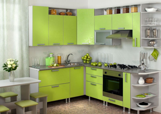
On the shades of green in the interior of a small corner kitchen in the Khrushchev
This color has a huge amount shades. The color Pantone system, all shades of green are a list of 376 tone. They are divided according to the brightness, lightness, warmth and shades of gray, brown, yellow and blue. Most of them relate to the natural color of natural analogues, such as color or green mint
color apple. Depending on the combination of RGB (red, green, and blue), are considered basic shades:
- Standard;
- Olive;
- Turquoise;
- Emerald;
- chartreuse;
- Aquamarine;
- lime;
- Fistashkovый.
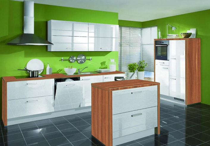
All colors are harmoniously combined with each other in various combinations. Designers create comfortable interiors in shades of green, where a fundamental tone is blended darker or
bright light green color.
Subdued olive tone is suitable as the basic background for the country, Provence or classic style. Bright colors distinguish the individual parts of the interior or functional zones.
By choosing green as a major in the interior, designers are guided by its ability to animate and make the elements of spontaneity, even in the most ergonomic interior.
Color combinations with gray, brown, yellow, white (Provence), beige, blue and other colors
By itself, the green color can carry different emotional shades, and in order, to emphasize a certain mood, use the combination of colors. To enhance the calming effect using brown, gray or blue shades. Resilient atmosphere amplify white-green range or addition turquoise, yellow, orange shades.
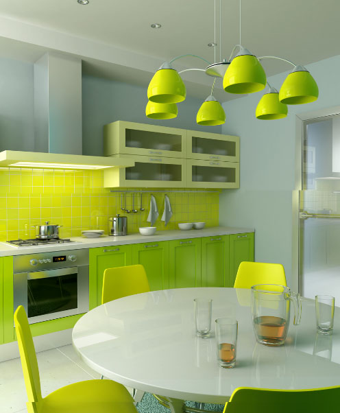
To emphasize the green in the interior of the kitchen used a combination of green with such colors:
- white. White and green kitchen - it's a win-win and a classic combination, in which you can easily add any other colors.
- black. Such a combination of black and excessive depresivnosti Frivolously light green balance each other.
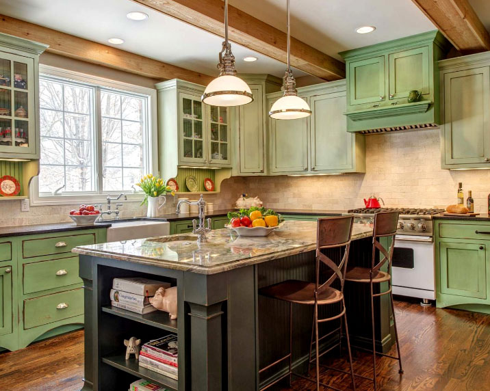
- wood. It is a natural combination, in an urban environment allows you to experience the breath of nature. Gray-green kitchen with light wood trim - a good combination for the kitchen in country style.
![Country kitchen in shades of green]()
- blue. Quiet and relaxing combination, which speaks of the phlegmatic and the positive nature of the hostess, leading an unhurried way of life.
- yellow. Such mixing of the most versatile, It can be combined, It creates a playful and lively atmosphere. Yellow-green color makes the room warm and creates a beautiful effect of the additional lighting in the darkened kitchen.
- orange. According to the emotional texture is similar to a combination of yellow, so often in the design combines three shades. In harmony with the immediacy of country style, where a homely atmosphere is created by warm colors and textiles. In this combination, it is important to select the same color saturation.
- red. By contrast, allow for maximum reveal a bright green color. Red is not used in the same amount, but only as a small inclusions. It may be facades headset or cushions on the kitchen corner.
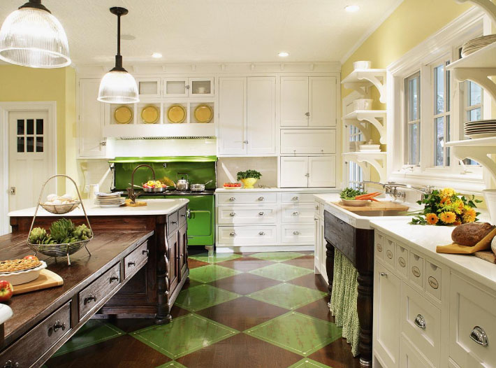
Curtains - key design, combination with wallpaper apple color
Curtains for kitchen selected depending on the design style of the room. Kitchen design in shades of green and requires an unconventional approach to the choice of curtains type. In this case, not necessary to use light and transparent materials, possible to apply the dense and dark fabrics.
If you choose plain curtains, then the best option would be light green curtains. A classic curtains the color green for the kitchen is considered to be beige or gold. If present in the interior wood trim, choose curtains made from natural materials.

High-tech style, Nouveau involves light and transparent curtains made of synthetic materials. The kitchen is green today - it's style and fashion.

