Kitchen in black and white
The combination of black and white - a classic, but daring contrasts, so black and white interior design of the kitchen is not the most common phenomenon. In addition, you need a good sense of color, not to transform a room in these colors in dark dungeons or the hospital ward. Yet such glamor kitchen with prudent approach will make it a central room in your apartment.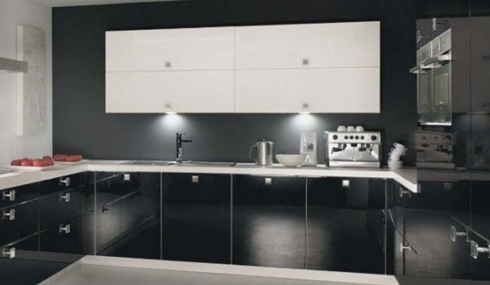
Kitchen in black and white add sophistication and elegance throughout the apartment, important not to forget, that is, the line between good taste and meaningless combination of decor elements, so the interior in black and white is chosen from all scruples and pettiness: Details decide everything.
Coffee and milk: a combination of contrasts
A common mistake when choosing the final design of this kitchen - it is an equilibrium mix of shades. In fact, black and white color in the interior should be combined according to the law the figure background, where one color is, other supplements.
It should give priority to one of the colors, insofar as, using a common background can always beat any kitchen item, whether the window, refrigerator or white gloss kitchen with black worktop. so, let's look at both options of background color.
Black queen
This variant is more common in private homes, rather than in flats. It is connected with the area of the room, in a typical apartment kitchen space is very limited, and black clearly delineates space, visually reduces its. Therefore it requires basic black room, area over 12-13 m.
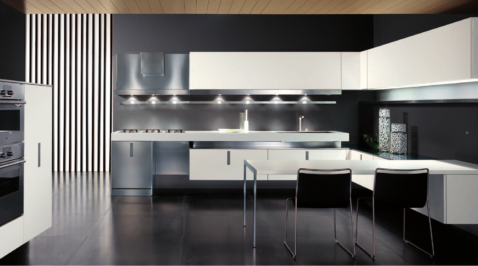
Another important parameter - the ceiling height, background black color looks more attractive in areas with high ceilings, low dark ceilings will "push", but high, black glossy stretch ceiling rather give effect goes to infinity, rather than lack of space.
Choosing the background color, consider the following:
- Natural lighting Fill a large number of electric. on the ceiling contour LEDs, large number of small lamps - light is needed not a point, and filling
- Use gloss - a great way to light propagation
- Bright - top, dark - top. Create a smooth transition between bright bottom and white top
white king
But the little black-and-white kitchen, in principle, leave the choice, then dominated by the white color. Black is the color of acts, in this case, as "figures", adding background colors. A convenient way to create contrast in this case - is a technique, white kitchen with black appliances looks like a minted coin: strictly, but gracefully. However, the choice entirely black equipment where space is also not a good idea, give preference to the same two color compositions. agree, white kitchen with black countertop looks attractive, than absolutely black desk.
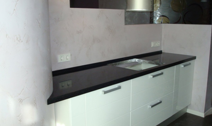
White as the background used in the spacious rooms, it creates an atmosphere of idleness and grandeur, but with one caveat: use sterile-white should be avoided, better to give preference to dairy shades. Even the floor is not necessary to make a sterile, black and white tiles for the kitchen should be that such, add on the floor pattern or use a shaped tile - refuse monotony.
For real stylish kitchen is created details. Complement common elements other hardware color: Black glass table, matt dark refrigerator, glossy dark tones facade, dark stools. If you touch the material, it all depends on the style, but more on that later.
Background white color requires other color inclusions, in our case - black. Spot black additive creates unique dynamics of color and space and gives majesty room.
The design and style of the
Apart from the difficulties in the laconic combination of these colors, at some point there is a matter of style, What projects can withstand such a composition, and where it is not necessary to use this contrast?
The style of decoration
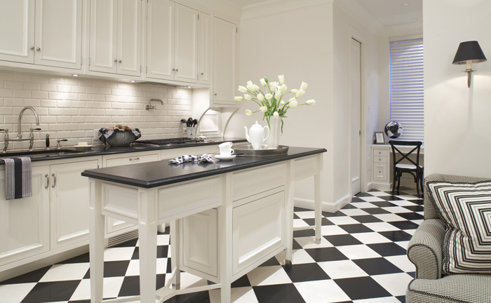
Let's start with a significant plus. Black and white mix harmoniously into almost any style, with the exception of, probably, country, where the emphasis is on natural color. Take a look in the nearest approximation to the successful versions:
- Classic. Here black and white interior would be the best combination. The same type of wall and floor with a slight difference in shades, blackout or lighting in furniture. The severity and monotony will result in the classic design
- Easy to modernity. The important part - the functionality, white kitchen in a modern style based on the apparent simplicity. Here it becomes important to add the third neutral color - metallic, use it standing in the technique, Furniture should leave black and white contrast
- In the middle 50's. Black-and-white film and shades, black and white in color for this area are key. By contrast, add specific "dust" of antiquity, and complement all goods can be handmade or actually do a couple of things with their own hands. And why not use finally Grandma service?
- Hi-tech and minimalism. Only the clarity of forms and severity of contrasts. Black glass and darkened metal, black and white
- Mural on the wall. tough zebra blinds - it blinds, no blinds - the acute dark countertop. Gloss black occupies a dominant position, if the kitchen design in black and white is represented by these trends
supplement third: soften austerity
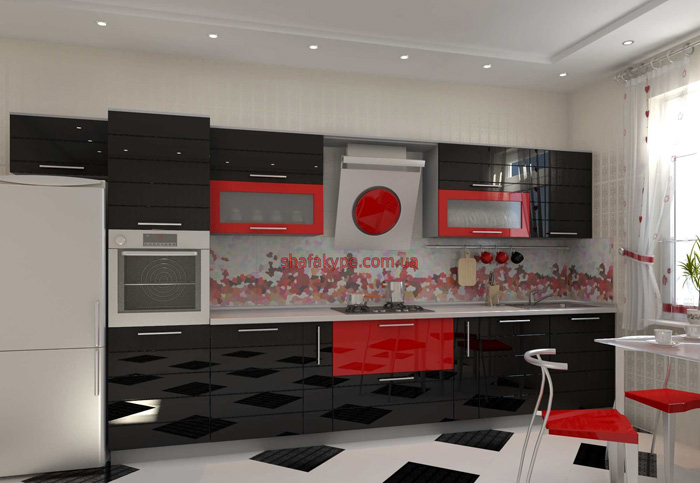
Black-and-white combination may be the only one in the kitchen style, but strictly black and white kitchen pleasing to the eye is not all, and therefore decided to dilute the color union other bright colors. Do not add colorful liveliness?
Choosing a third color, consider, your contrast - saturated and self-sufficient, so gentle colors are rejected immediately. use the brightness: contrast to basic black, choose red and green, white is perfect blue and orange. note, the color should be bright, but not acidic.
In what elements to use a third color? It depends entirely on you: love often change styles, but permanent repairs you are not satisfied - then use the complementary color to small appliances and accessories. In such cases, the use of up to three additional colors. Otherwise, the black and white kitchen diluted color. by the way, not necessarily looking for the right color technique: dishwasher can paste over self-colored decorative film.
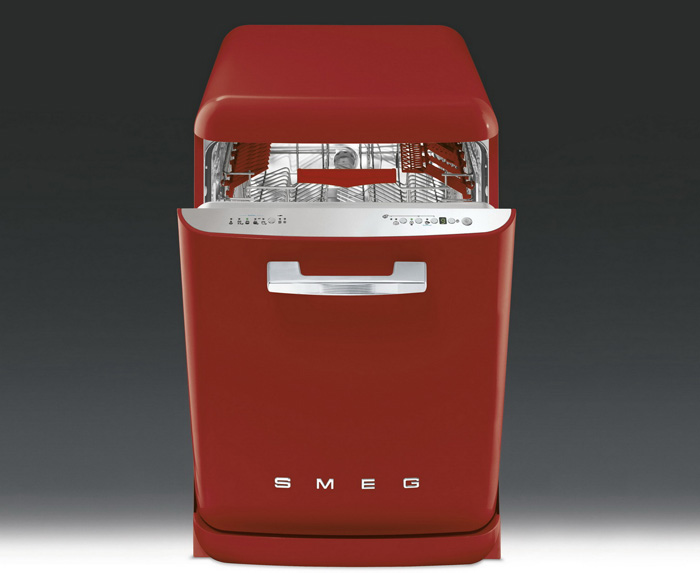
Regarding the strong additions in a different color, worth mentioning, what can and curtains for black-and-white kitchen to make alternate colors, but do not choose the plain - it has eyes. Simple geometric pattern with minimalist design will look tematichno.
It is important to understand, that by using a third color in large appliances and furniture should be reasonable, two additional colors are already limit. Use more only when diluted with small household appliances and accessories.
Congestion space arises not only because of the color of the storm, but also because of incompatible forms and textures. To create an airy kitchen, use the following ideas:
- Top (not necessarily the ceiling) - in shades of white
- Omnipresent gloss - use it to the maximum
- Minimalist patterns on the walls
- dark, but the transparent door in shelves and cabinets
- Smooth in lines with contrast transitions
Constantly worth keeping an idea in your head, that not only black and white kitchen in the interior of the entire house does not look pretentious, but also elements within the kitchen should be a place.
word practice: arrangement art
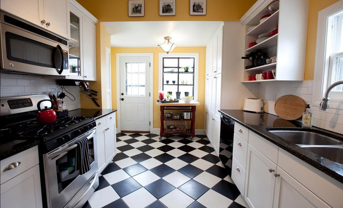
If you ask a question, what color is more susceptible to contamination, you immediately answer, the white. De-facto, kitchen in black and white style proves the opposite: require more care will gloss black. Unfortunately, them much better type of dirt, scrapes and scratches. But the cost to use white with fear: completely white floor will soon lose its original whiteness.
If you are willing to pay a regular hour cleaning, that such details are not necessary to take care, but if the kitchen for you in the first place - the place of cooking and food intake, then consider, that part of the work surfaces should not do white (there a way to help the chessboard). Paul, on the contrary necessary to shade in some places, eg, patterned black and white tiles. Another option is to save the black - is the use of artificial or natural stone, but this way is much more expensive.
Another plus is the white work area - the dirt is noticeable immediately, and get rid of it before you can, it turn into poorly laundered problem. Of course, Colorful surface is not as well detected contamination, but also to see them without special consideration will be difficult. For cleaning do not love is a great option, but such spots with a total cleaning of premises have been laundered with chemistry, that is not particularly useful for surfaces and hands.
When cleaning is necessary to pay the general rules for the care of one or another surface. Natural wood does not carry excessive moisture, Glass should be cleaned with a soft sponge using gels, so as powders simply scratched surface. The same goes for chrome parts.
And the council, regardless kitchen design. Used in the design of the kitchen wallpaper should be washable. Floor laminate should retain moisture and does not swell under accidentally spilled a drink. If you are using paint, the waterproof and most importantly - not toxic, eventually, you prepare a meal in this place. Here's a she kitchen in black and white.
