How to combine the color of Bordeaux in the kitchen?
burgundy color symbolizing power, luxury, power. Monarchs of the world preferred to surround himself to them. It was used in the design of clothing, furniture, for interior. The rich decoration in such a high-color demonstrated guests, important visitors and visitors. Cherry hues emphasized wealth and abundance of resources in the country.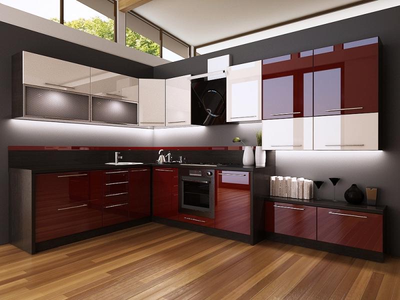
The modern color bordeaux arrangement advantageously used in kitchens. It is popular in high-end restaurants. It is believed, that this kitchen would prefer a confident person. His choice is well founded, because individuality, fill the interior solidity.
Features and shades of burgundy
Color cherry furniture netryvyalnыy, but there are other benefits. He has a strong power. It's the combination of scarlet and brown, which mutually complement each other and displace. The combination promotes the formation festive mood, but not devoid of peace and comfort.
Dark cherry color - practical. He does not get dirty, it is not noticeable dust, mud, food debris. If there are scratches or abrasions, they are hardly distinguishable. This is particularly appreciated by all housewives.
cherry color, according to the medical and psychological research, relaxes, It normalizes the nervous system and the blood pressure. Effect in addition to dinner (or other food intake) plus will not.
But wine-colored kitchen should be diluted with other shades. Otherwise dignity zeroed or worse - turn into disadvantages.
color combinations
What goes burgundy color and its shades? There are many successful combinations. The most successful of them:
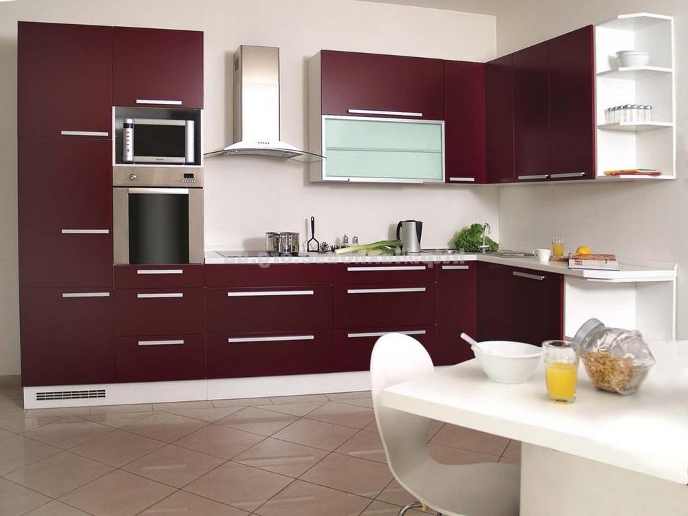
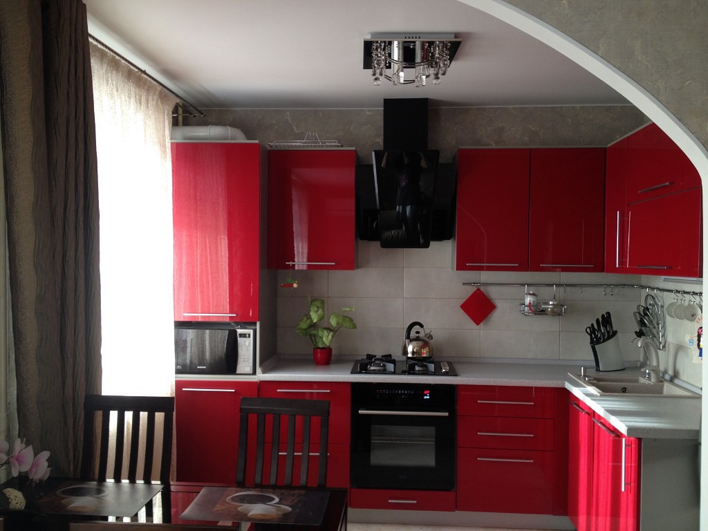
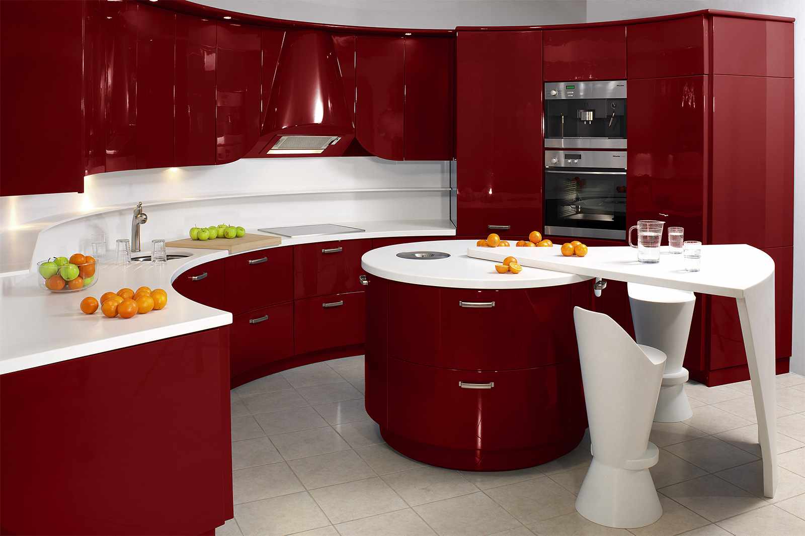
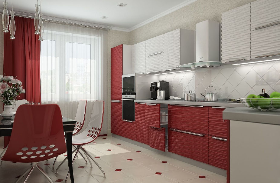
- The combination of burgundy and white. tandem spectacular, the latter looks at the rich cherry background. If you add black, the increase rate of elegance. According to the designer, this combination is the best possible.
- Carefully you have to combine with green bordeaux, tk. the brightness can overzealous. fit muted shades, like olive or green tea.
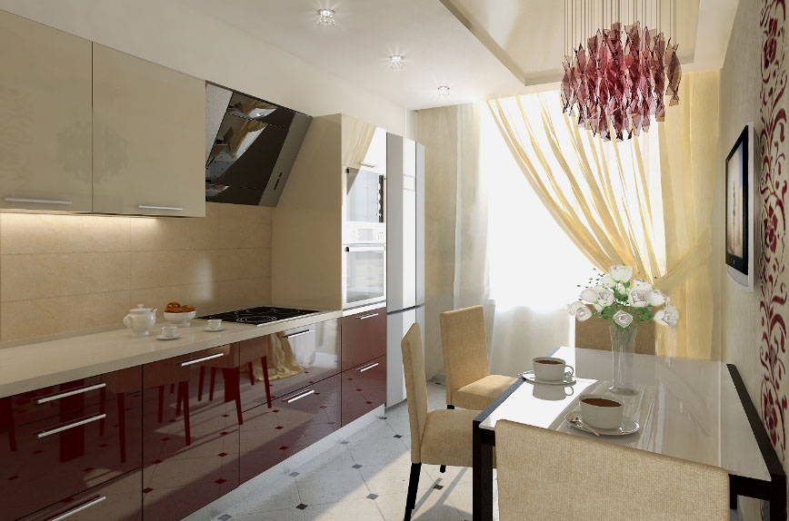
- The combination of a burgundy color soothing neutral shades (beige, lactic, pale pink, blue, etc.). The combination of overflowing warmth and tenderness, that provides comfort, harmony.
- Coral Bordeaux blends bad. If left alone, these two colors in the interior, get bad taste. Coral can be used in the details, Basically it shall not be. But when it is properly assembled with the elements of interior design and decoration, the situation is striking in its originality.
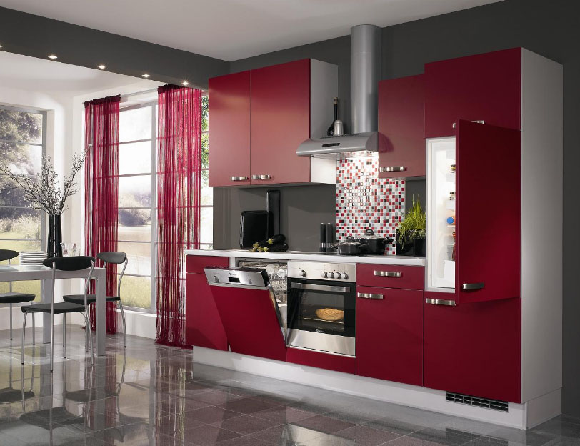
- The combination of a burgundy gray. unsuccessful tandem, if you do not add a third hue. Gray matter how dilute, shares tone, or a background;
- The combination with black shades casts gloom. But if you know when to stop, then it is possible to achieve consistency, style definition.
maroon shades, and their use
Light and dark maroon color are warm palette. They visually bring items. Therefore it is impossible to use them in a small room. Although in this case used in the details bordeaux.
Another cherry blossom loves good lighting, regardless of the hue. The lack of light aggravates the situation with a decrease in visual space. For this reason, designers recommend to combine it with light delicate shades. Then he looks more saturated and bright. It is better to use lamps with diffuser - they do not press on the eyes.
Shades of burgundy seldom blend in direct contact with each other, you need to separate them, eg, white or beige. If you choose light shades, then use black or gray in between.
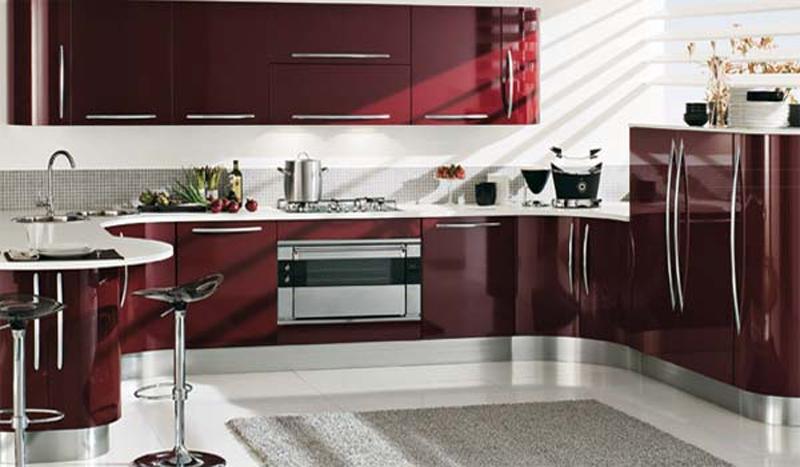
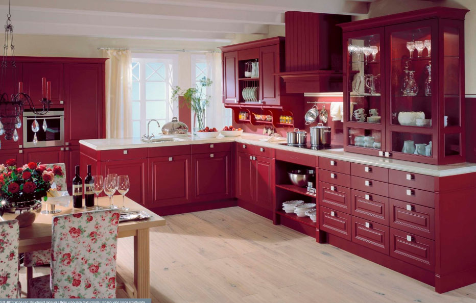
Kitchen cherry color is light or dark. The solution is focused on other details of the interior and / or finishing.
style solutions
Cherry cuisine unique, tk. Its peculiarity lies in the perfect combination with any interior. Designers prefer to work with modern styles, but classic looks solid.
Need to know, how to combine furniture, to get a good Interior. The process depends on the selected style:
- Luxury art decor. Cabinets are finished with gold or silver edge, places set gold fittings;
- Classic. Wooden solid furniture processed maroon material (paint or, eg, laminate cherry). Chipboard or MDF look cheap, style is not maintained;
- Country. A complex combination of ease with solidity, only by designers. It is necessary to combine unpretentious furniture "antique" with seasoned lines Headset. The role played by the right accessories;
- High tech. The emphasis on functionality, saturation techniques, in the appearance of which has a color burgundy;
- Minimalism. Here the only change - covering furniture glossy acrylic or laminate. Matt color does not fit. Impressive look chrome, eg, on modern technology.
To sustain the chosen style you need to follow the advice of designers, the rules of the harmonious combination of clear and color matching with the shades. Lacking skills, experimenting with Bordeaux dangerous, fraught with tasteless decor in the kitchen.
decoration
Kitchens in burgundy color successfully in harmony with light walls. This shade more brightens them. The permitted use of a silver or gray finish as detailed. When Bordeaux is involved in decorating the walls, the headset merges with them. Light wallpaper or paint will emphasize choice of primary color.
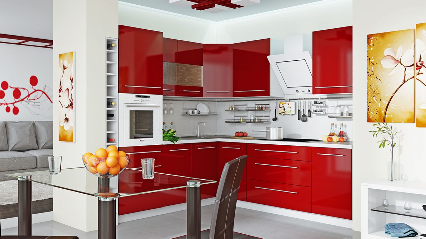
undesirable, to any part of the trim color scheme repeated Headset. For example, burgundy stretch ceiling will visually enlarge, fall, approach the person. Therefore, there is a sense of "caves", crushing space. It is better to perform the snow-white ceiling, it is visually expand the kitchen area, eliminate backfire headset or furniture.
White floor harmonizes with the burgundy suite, but it is impractical. Designers recommend classic brown or beige shade. Ideal - black glossy floor. But it should be a lot of details in soft and bright colors, otherwise the kitchen environment filled full with dark rich colors, it becomes oppressive.
it's desirable, to some other elements of decor and interior appears tinted support, not bordo. Well look pale pink or beige air curtains tablecloths.
Furniture and interior details
Headset surface may be glossy or matte. The last will give the effect of austerity, first - festivity. The most functional version of the matte, tk. it is less noticeable flaws. And they always appear in the kitchen.
Furniture can be performed using glass surfaces. Successfully combined with the color of the stones, mosaics and tiles. by the way, if properly applied a mirror finish, Bordeaux is suitable for small spaces, it will visually increase the space.
Kitchen Bordeaux looks attractive, if in the interior of many parts, such as curtains or tablecloths, napkins or towels.
it's desirable, that they run in the same color palette, allowed different shades.
Burgundy color in the kitchen - a symbol of luxury and wealth. You can not use it lightly and boldly, frivolity are not allowed. Only competent approach to the creation of the interior is able to make the kitchen a noble, comfortable.