The ideal kitchen facade colors: Secrets tasteful
Flipping through furniture catalogs in search of the perfect kitchen set, get ready to face a range of, from whose eyes run. Differing in style, content, flowers and prices, suites beckon shoppers with glossy pages. To avoid the headache by such a wide variety of, We recommend to set clear priorities. Decide on stylistic direction, estimated price, materials and the color solution buy furniture.
About the color of kitchen fysadov and will be discussed in this article, we will tell you the basic rules of color combinations, tell about their impact on the emotional and psychological state of the person and help you take the right decision, which will make your kitchen a harmonious and unforgettable.
The Psychology of color
Has not from time immemorial, people have begun to study the "color language", direct proof is in the numerous myths, tales, religious and philosophical treatises. Now the direct influence of the surrounding callers on our psychological state of mind and emotions - a scientifically proven fact, and coloristic, about colors science, their combinations and features, are required to study not only the designers, but psychologists. For example, role and importance in green Psychology invaluable, because for our psyche, he is most favorable and natural, carrying the peace and stability. These properties have long been widely used by professional decorators.
The combination of colors in an apartment are selected based on the following parameters:
- room size;
- Illumination, side of the world. for kitchens, windows facing south or west side, preferably cold gamma. To the north and east kitchens preferable color facades warm colors;
- preferred style. After all, the classic style involves the use of all 2-3 colors plus white, while Provence - 4-5 tone;
- own preferences. When choosing a color for the kitchen fronts, Try not to focus on the beauty and visual appeal of the proposed design solution, and on their own sense of inner peace, it should be the main criterion.
A few interesting facts about flowers, drawn from practical tools for design:
- Prolonged exposure to intense colors irritate the psyche and eyestrain.
- Yellow, filling all the surrounding space, It promotes eyesight. It means, that monochrome yellow kitchen can cause frequent trips to the optometrist.
- Fans of dynamic pastime fit and contrasting bright combination, and prefer to while away the evening in the quiet family circle - soft, pastel colors and shades.
- Studies have shown, calmly all human retina moves a green color, and the most tiring for her violet-blue. not without reason, Green means life in psychology, harmony and kindness.
- Do you want to fill your home with light, purity and joy? Basics of color to help you. After all these emotions represents white, which the, among other things, help visually expand the space.
Basic color rules
Correctly chosen color scheme is able to cheer up, tone, set a positive and active attitude. Or, conversely, will relax, relax mentally and physically.
To the kitchen from the door I feel the harmony of color and flavor, the following guidelines:
- The bright color schemes will enliven the interior, visually push the wall. Brown - will bring peace, but not suitable for small spaces, optical space narrowing, making furniture more cumbersome.
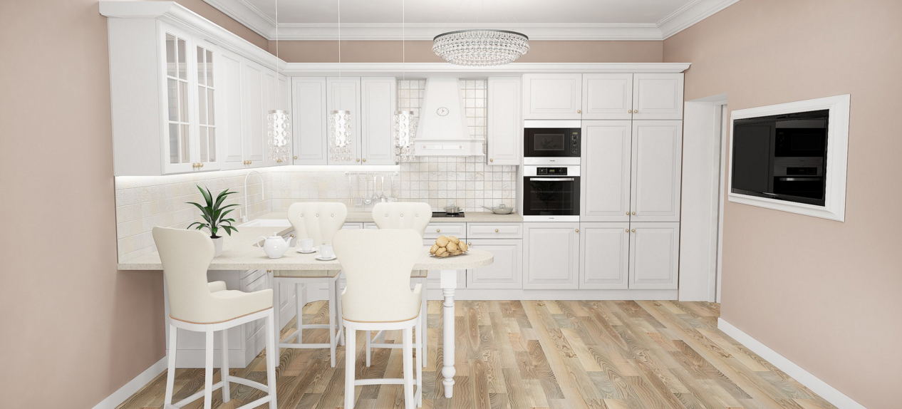
- For monochrome kitchens preferable to choose a beige color, any shades or white, in psychology denoting perfection, purity and spirituality.
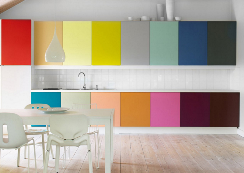
![beautiful color headset]()
- Successfully implemented in the kitchen Golden Rule Design: the closer to the ceiling, the lighter tone. Bright facades of the bottom row will be balanced lockers and drawers of the upper tier for a couple of shades lighter.
- Kitchen apron and wallpaper play the role of link between the horizontal and vertical (fridge, penalty) elements of the situation in different shades. Preferably, to contain a mix of shades.
All the richness of the color spectrum is divided into:
- warm palette, excitatory, energises, Calls for Action;
- cold palette, soothing, relaxing and calming.
warm colors
To the basic palette of warm colors include:
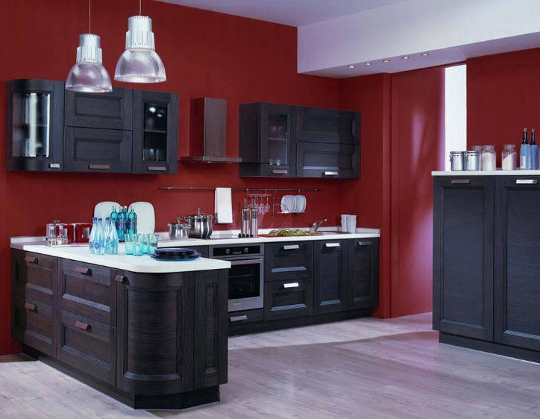
- Red - a shade of passion, temperament, fire and life, paint the everyday life in bright colors. Its dominant choose active and energetic people. The combination of red color with other colors will help to avoid overstimulation, excessive intrusiveness and activity. This effect is achieved in tandem with white, metallic or black. Original and surprisingly fit into the interior kitchen red and green, it is not surprising, because the nature of this relationship is common.
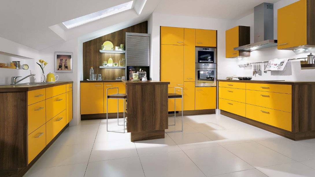
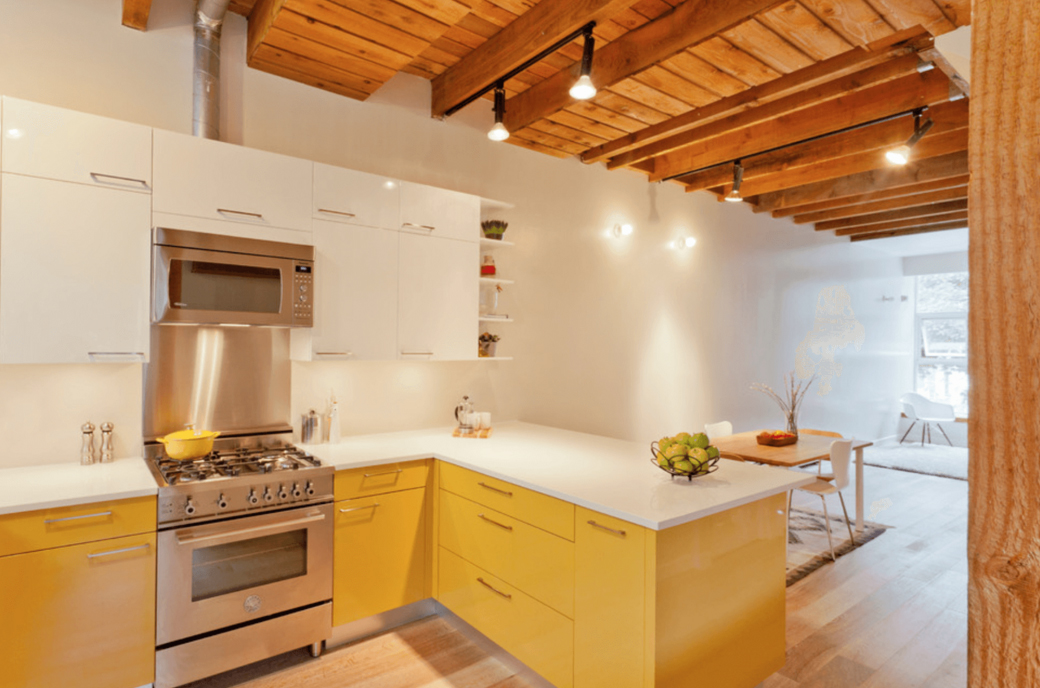
- Yellow will bring to your kitchen a feeling of warmth and sun even on a cloudy autumn day. It stimulates creativity, suitable for culinary daring experimenters. Dilute this color, you can use black and white accessories, and bring positive notes to help bright red or orange blotches.
- Orange - guarantees a good appetite, mood, burst of energy. facades, performed in similar colors, facilitate easy communication.
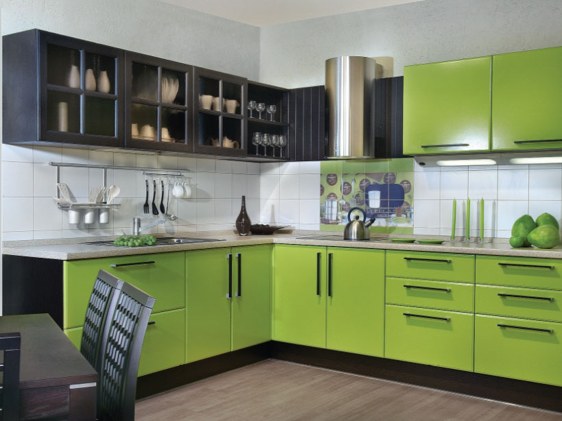
- Lime - belonging to the range of callers warm shade of green. It helps create a cheerful mood in the soothing surroundings. Light green color in psychology is a symbol of the liberation of latent power, promotes contact and communicate with the outside. Kitchen in such paints will be similar to the paradises of peace and tranquility in the ocean.
cold palette
This group includes the following main color scheme:
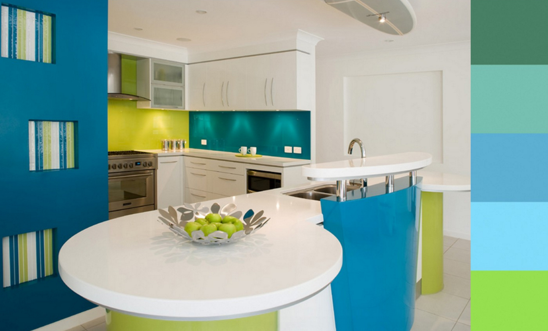
- Blue - the color calm and carefree. Suitable for calm, balanced people, confident optimists. To avoid the feeling of coldness and alienation, which can cause the tone, usually used on solar kitchens. Green and blue color - contrasting combination popular, which will help open up the heavenly hue and start playing.
- Blue symbolizes constancy, relaxation and peace. Shades of blue for kitchen design is chosen phlegmatic personality, striving for peace and order in their lives. A useful property of this color scheme is the ability to increase the space in the depth and height, which makes it convenient for the design of small spaces. Avoid the negative impact on the human psyche blue bright help, pastel and contrasting combinations. It looks spectacular blue-green color, but in the absence of explicit dominance of one of the tones.
- A life, Spring, nature, perseverance, nobility - all this means green in psychology. In design, it is also widely used, making a joyful tone in interior and reviving its.
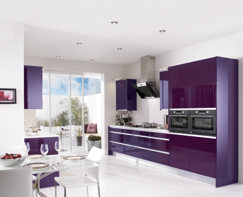
- Violet, or indigo - the magic and the magic shade, represents all the new and unconventional. Kitchen creative people prefer in a similar scheme, sensual and vulnerable, seeking to impress and amaze others.
irreconcilability colors
In its work, the designers are guided by a small tip - the color wheel, that bear the names of colors and shades. With it, are the most harmonious combination, It achieved a perfect balance of cool and warm tones.
The figure below shows a modern, improved, version of the color wheel, created by the poet Goethe. Rumor, that work in the field of color he valued even higher literary achievements.
Goethe's circle consists of three primary colors - red, yellow and blue, and three additional - orange, green and purple. Between the pure colors are located countless number of intermediate shades.
staggers, located opposite - polar, enhance the properties of each other. What does: green and red, for example - the perfect contrast. Apply them in the same room can only be carefully designed to the last detail. Otherwise there is a risk to create an overwhelming and bothering interior.